Services Provided
Stepping Into a World of Dosa Wonders Where the Aroma of Spices Fills the Air
Webandcrafts tried to incorporate some delectably desirable virtues into the brand ideation process of Dosa Kada. An eCommerce food platform aimed at delivering perfect delectables for anyone who wants to experiment and experience South Indian Cuisine. With vivid red and bright orange as primary colours, we crafted a logo with a custom font which elevated the brand persona, giving it that extra “crispiness”.


Context
Infusing Taste and Culture into a Logo
Food is a major representation of a society’s culture. For people staying in foreign countries, food brings memories, nostalgia and a taste of home. This is exactly what we tried to infuse in the branding of Dosa Kada, an authentic pure vegetarian South Indian restaurant serving fulfilling flavours for over four decades in the UAE.


Goal
Bringing Back Memories of Fulfilling Food
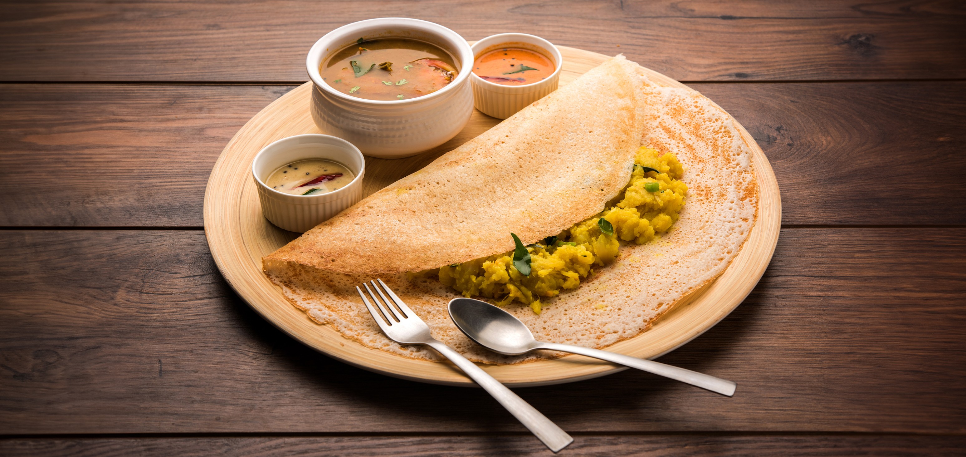
Dosa is a comfort food that has a special place in the hearts and palates of every Indian, particularly those from the south. Webandcrafts wanted to impart this emotion into the logo that personifies Dosa Kada. The goal was to bring back memories of enjoying food that fills not just the stomach but also the heart and soul.

Challenges
Creating a Logo Soaked in Authenticity and Tradition
Dosa is a thin crepe made from a fermented batter of ground lentils and rice. Dosa is prepared by thinly spreading this batter on a hot tawa in a circular motion. This preparation method, which any South Indian can associate with, was the idea that Webandcrafts replicated in the logo. Moreover, we wanted the logo to look like D, the first letter of Dosa. The name Dosa Kada was written in the shape of loose batter to perfectly complement this unique dish. Dosa is usually accompanied by vada, a crispy fried snack made using urad dal. Both dosa and vada are served along with samba and coconut chutney. This was the inspiration behind the use of red, orange, and white in the logo.


Impact
Crisply Representing the Craft of Comfort Food
DOSA KADA is one of the oldest pure vegetarian restaurants in the UAE. They have been serving customers with delectable delights since 1983. Webandcrafts’ branding and logo ‘crisply’ represented what Dosa Kada has been cooking up for the last four decades.