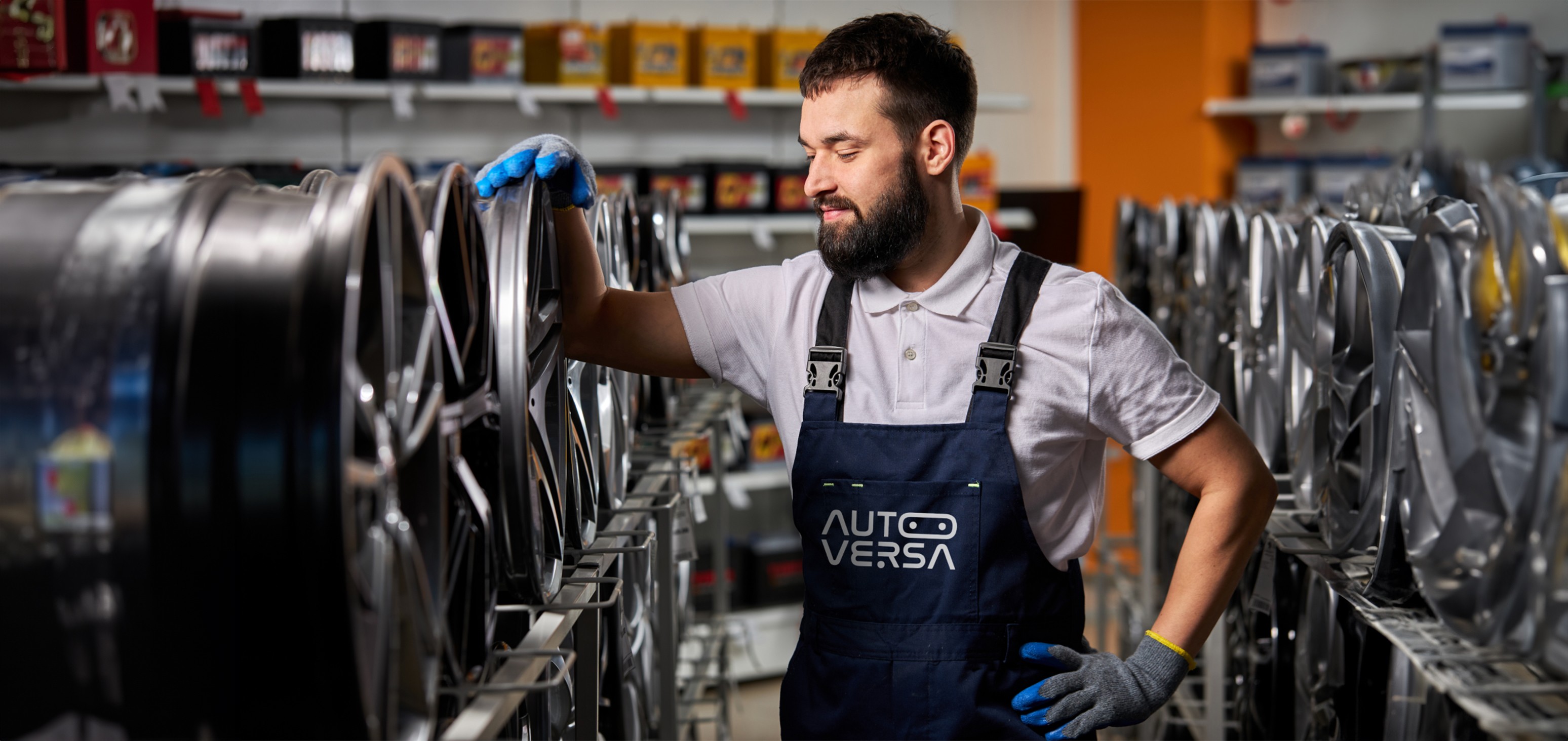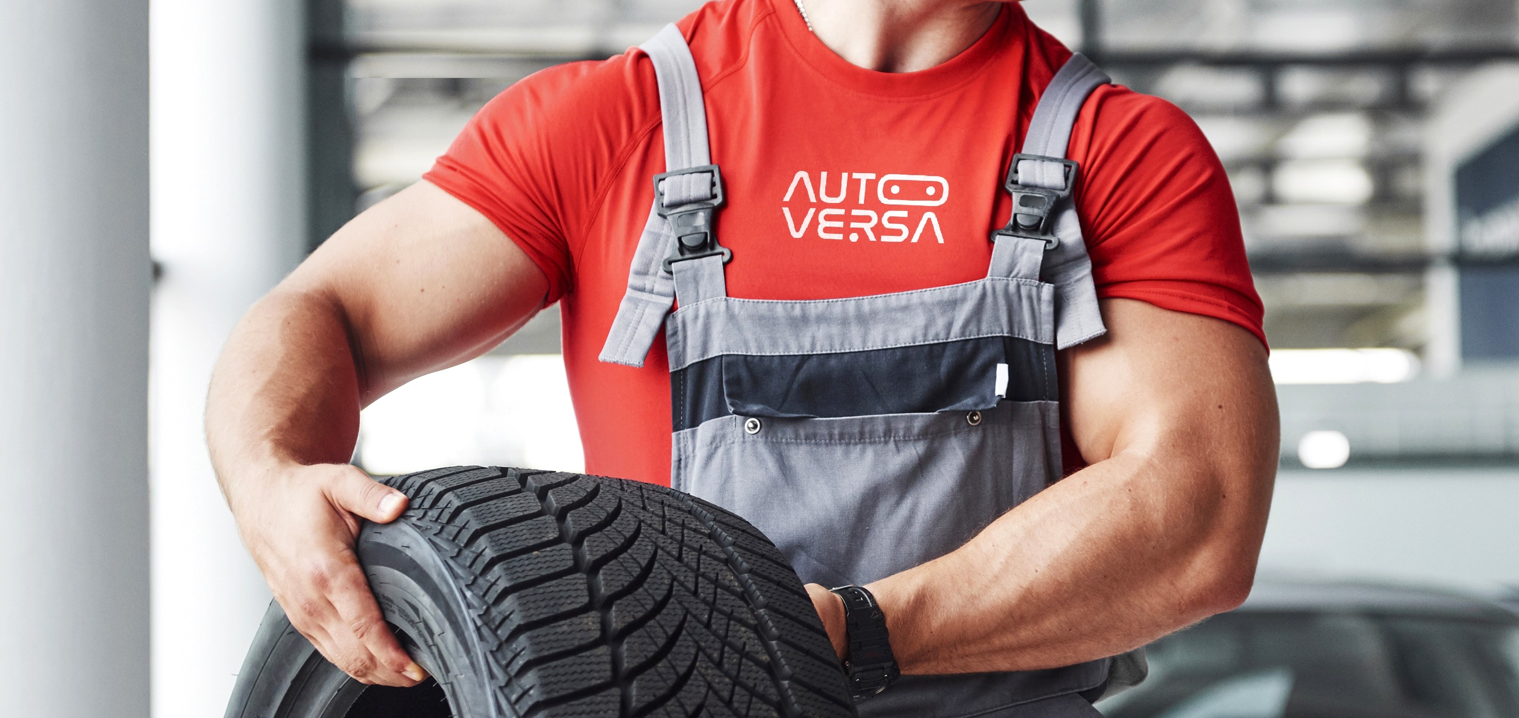
Services Provided
The One Stop to Maintain Your Four Wheeled Chariot in Perfect Motion
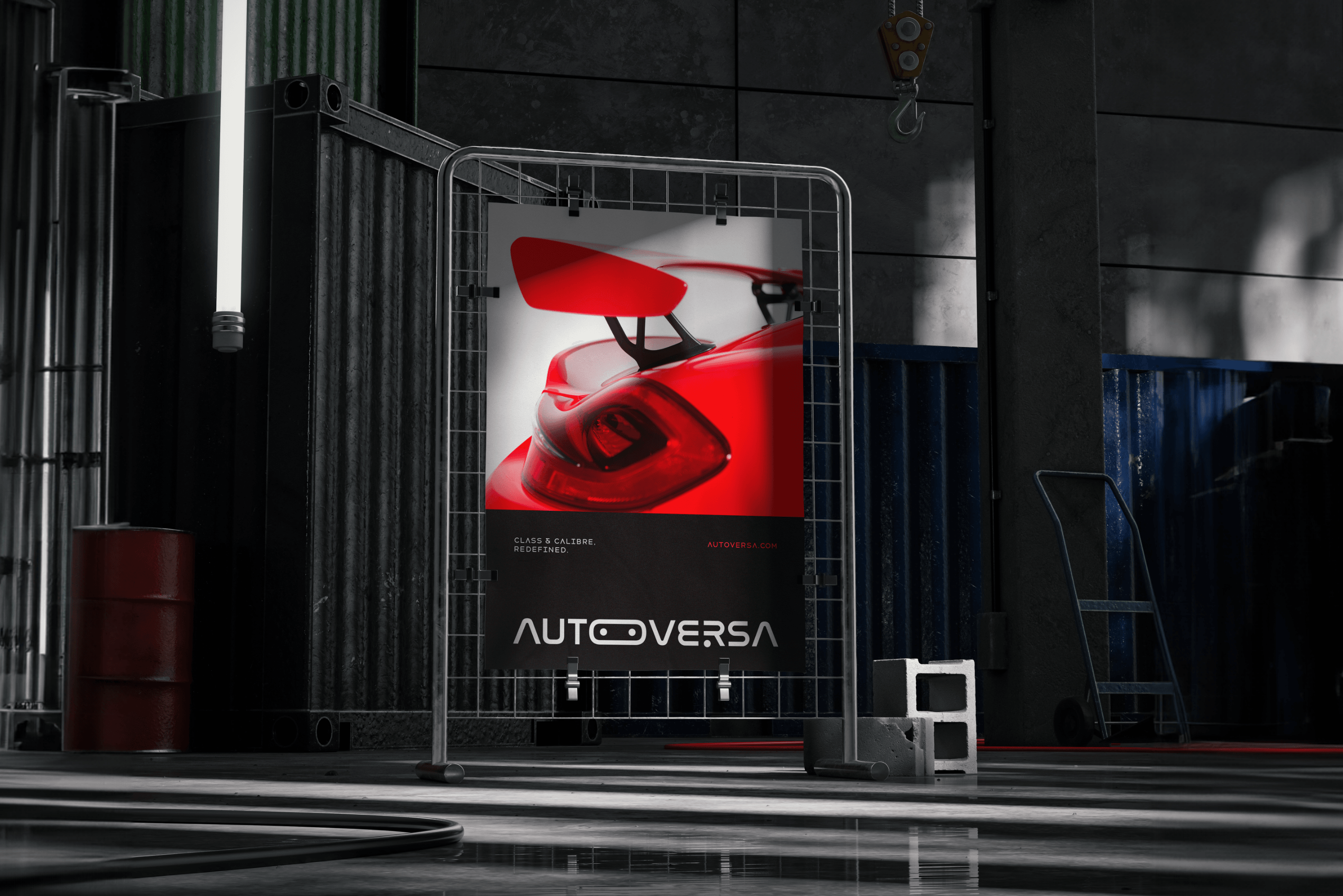
A well-versed criteria was put into the right spot in the brand logo of Autoversa. a prepaid car maintenance app store with timely pick-up and delivery, condition monitoring, delivery status information, and much more. Through a minimalistic creative approach, we redefined the textual outlay of the brand logo with smart automated lighting of headlights in the letter O, combined with the gear shift thoughtfully aligned along the letters E and R, Nevertheless, the adoption of navigation symbols affixed to the typography using A and V elevated the brand voice to top gear!


Context
A Unique Proposition for an Exceptional Service
The founders of Autoversa had a unique proposition - a prepaid luxury car maintenance app store that would be the one stop solution for all luxury car related services in the UAE. Their idea was to offer peace of mind to luxury car owners who sought personal attention in keeping their pride and joy reliable and running smoothly. They approached Webandcrafts for the branding of their new venture.

Goal
Living up to the High Expectations
Autoversa wanted to offer a hassle-free solution to all luxury car owners in the UAE who wanted to keep their cars well maintained. Their goal was to offer a platform that owners of luxury cars could rely upon. Webandcrafts was tasked with creating a brand image that perfectly matched this expectation.


Challenges
Going Toe to Toe With the Big Boys
Autoversa caters to owners of high end luxury cars that belong to world renowned automobile manufacturers. We needed to create a brand image, logo and tagline that were not only simple, but also effective in grabbing the attention of high end car owners. This was a monumental task. Every aspect of the Autoversa brand, including the logo and tagline needed to be unique and stand out to a premium audience.
Process
Portraying the Pleasure of Driving in a Logo
A detailed discussion with the Autoversa team kickstarted the process. Conversations with the client culminated in Webandcrafts coming up with the name Autoversa from the words automotive and universe. Once client approval was secured, we moved on to the logo design process. We needed to bring a futuristic element to the logo to stay in line with the advancement of technologies in the automotive industry. But at the same time, we had to stay true to the pure passion of driving. This culminated in the creation of the Autoversa logo. The first half of the name featured two headlights incorporated into the letter O. This robotic-eye represented the futuristic approach of both premium cars and Autoversa as a brand. The second half contained a gear shift pattern subtly aligned between the letters E and R and symbolised the connection between a car and its owner. To top it all off, we combined the two words by turning the two starting letters A and V into symbols that represented navigation. The icing on the cake was the tagline that perfectly reflected the ideology behind Autoversa.


Impact
Understanding the Client to Conquer Another Milestone
Autoversa was very impressed with Webandcrafts branding work. We perfectly understood the client’s vision and mission for the project. Detailed discussions helped us map out the needs and requirements. The brand name Autoversa is a great example of how understanding the client’s needs helped Webandcrafts create something unique. Moreover, the tagline ‘Class and Calibre Redefined’ clearly represented the type of service the client wanted to provide. Expanding our horizons in the unique automotive industry was also a welcome side effect.