9 Key UI Design Principles for an Effective User Interface

We interact with interfaces every day, often without realising it. An effective user interface helps users find an exciting user experience to perceive a product as useful.
What is UI Design?
User interface design deals with creating a visual arrangement and appearance of websites or apps – digital interfaces with which users interact. The whole focus of UI design is to provide as pleasant and engaging an experience as possible to the user while ensuring the functionality of the product. After all, it’s the UI design that helps users decide if they want to continue interacting with the product or not.
UI elements include how buttons are arranged on a page, the messaging that guides you to create an account, or icons that help you navigate an e-commerce site.
Types of UI Design
- Graphical User Interfaces (GUI): the most commonly seen type of UI, this is what we see in websites and apps.
- Voice-controlled Interface: These interfaces initiate action through voice commands. Alexa and Siri are examples.
- Gesture-based Interfaces: Motion-activated interfaces are mainly used for virtual reality games and similar apps.
UI Design vs. UX Design
UI designers and UX designers often collaborate as they are closely related. UX design deals with the overarching user experience and is concerned with the usefulness and purpose of the product, and how the user feels about it.
UI design, on the other hand, is concerned with the product’s visual and interactive elements, like the icons, buttons, layout, colours, and typography. Both are essential for positive results. The overarching UX strategy must be properly supported by robust UI design.
User Interface and Web Design
UI/UX design is essentially product design; the designers have to work within several restrictions to ensure the user experience is outstanding. Web design offers greater creative freedom, and goes deeper than merely ensuring a great experience. Web design has to consider factors like increasing traffic, conversions, revenues, and brand building through the development of exceptional websites.
Read More: Website Architecture Design: A Detailed Guide
What Are UI Design Principles?
UI design principles are like rules or strategies employed by a UI designer to make sure that the user has a pleasant experience interacting with the interface. The best UI designs put users in control, help them understand, and enable them to predict.
Why UI Design Principles Matter?
When you employ UI design principles, you make digital products intuitive and enjoyable. Clear signboards that convey the logical flow of steps to users to take them to their goals – through clicks, scrolls, and other interactions; this is what it’s all about. Clarity and consistency make it easy for designers to make decisions; by establishing the principles at the outset, the guesswork is eliminated, and product team efficiency is increased.
Importance of UI in HCI (Human-Computer Interaction)
An HMI or Human-Machine Interface connects humans and machines/devices/systems. It is used most for industrial processes, though it can be applied to any screen where users interact with devices. It functions as a communication touchpoint between the system and the user.
HMI offers a simple and effective way for operators to manage, supervise, and organise processes and devices. It helps in implementing industrial automation processes perfectly. Energy, healthcare, oil and gas, power, transportation, manufacturing, and recycling are some industries where this is extensively used.
Design Principles in HMI
HMI design principles are much like UI design principles. They are guidelines that help make the system user-friendly, and capable of guiding, providing feedback, and preventing errors. It is concerned with layout, colours, icons, typography, animation, buttons, menus, and navigation.
Read More: The Art of Drafting the Best UI/UX Design
Golden Rules of User Interface Design
Clarity and Consistency
In this context, we mean including familiar elements (like navigational menus and buttons) and user-friendly features . People tend to look first at the top of the page and the left corner for the navigation menu and the brand logo, and that is exactly why websites place them there.
Simplicity is crucial for any design to be impactful, and for that, clarity is critical. To put it simply, you need to show users what they need to attain their goals in a straightforward manner; no clutter, no distractions.
Less is more! Neat, uncluttered UIs make for user-friendly products that engage users and meet their needs. If you look at the most popular apps, you’ll find that their interfaces are aesthetic yet simple, allowing you to do what you want without hassles. The focus is exclusively on the main functions that users want. The sleeker and more intuitive the design, the simpler and clearer your products.
- Include white spaces to help elements get noticed, and users to consume information easily
- Ensure consistent typography; stick to one font, and choose one without tails or gaps that is clear and legible. Fonts also must align with your brand.
- Design systems make interfaces easy to follow. Providing design cues via predictable controls and familiar signposts helps users navigate the interface and have an enjoyable experience.
- Using consistent patterns over time makes elements familiar and predictable to users, and this makes the designers’ work simpler too.
Efficiency
What’s an efficient UI? Well, it’s one that doesn’t take the user on a song-and-dance routine to finish a task. You must be able to expect what they need at each step and minimise the time they have to spend to complete a task. Do away with redundant taps and clicks, and save their time.
Checking out carts on an e-commerce site is a prime example. The successful sites have minimal steps, offer guest checkouts, save customer info for the next purchase, and so on.
Feedback and Error Prevention
It’s important to let your users know that the actions they took have been completed; if something has gone wrong, they should be told that too. Don’t keep them guessing if the action they took went through! Frequent actions can be given simple acknowledgement, and important or rare actions warrant more elaborate feedback. Instant feedback reassures users.
For example, when a user clicks on add to cart, a checkmark icon, or ‘item added to cart’ can be displayed, and the user knows the action was successful. You must have noticed the feedback, when you pair your Bluetooth headsets with your phone or car, often there’s a voice message saying, ‘your device is connected to xyz’. These are all different forms of feedback.
The design process never really ends; it’s more like an endless loop where you repeat steps to stop errors and improve. Once you launch, monitor how your design functions, and then tweak it to make it better. Iterations can be through getting customer feedback, beta testing, or checking analytics to see underperforming pages or low conversion. Did you know, that even a small change in the checkout page design can reduce cart abandonment and boost conversions?
Of course, there’s no one-size-fits-all method. People’s preferences vary across the board, and so do business goals. But play around, experiment, and you’ll end up with an attractive, intuitive, and lucrative UI.
Flexibility and Responsiveness
These two are critical UI design principles that assure users of having an optimal experience regardless of the device they use. These principles can be achieved by employing these techniques:
- Adopting a mobile-first approach helps ensure that your UI is flexible. Media queries, fluid grids and adaptive images are some responsive techniques that ensure one design is rendered flawlessly on any screen. Why is this crucial today? That’s because mobile use is rapidly overshadowing PC use!
- Scalable interfaces are those that can automatically resize to fit any screen size, making it easy for users to read. With flexible layouts, the user experience can be optimised on any device and also ensures that the critical visual element remains prominently displayed. Every element, whether images, text, or icons, must scale proportionately to provide accessibility to all users and deliver impactful experiences. Voice-based interactions can provide accessibility to disabled users.
- Using dynamic type ensures that fonts scale so that it is always readable.
- It is critical to test your design across devices to verify that there are no flexibility issues.
- Build learnability into the design so that new users are able to familiarise themselves with the use of your product, but also include accelerators that help experienced users complete their tasks quickly.
Minimalistic Approach
Minimalism is key in UI design – whether it’s the appearance or the steps the user needs to take to complete tasks. UI designers reduce data and ensure lean apps by incorporating modal windows, bottom sheets and similar overlays. However, the information must be arranged logically, and it must be self-contained and autonomous. Thematic and practical grouping of tasks and subtasks is absolutely crucial in UI design.
Subtasks and screens should be exactly where users expect them to be – organised clearly and logically. For example – one wouldn’t expect the computer to be in the washroom!
Most importantly, always remember your target audience – the people you are designing for, and the reason behind it too. Effective UI design is simple, functional, and intuitive – it’s not for showing off the designer’s skills. Such designs are often distractive, and take focus away from relevant elements.
Accessibility
User skills and abilities are likely to fluctuate widely; the UI designer needs to factor this in when crafting the design. Obviously, one cannot design for each and every individual with different traits who might use the app.
However, it is imperative that a wide range of skills should be considered. Users could be from completely opposing cultures: one example is people reading from right to left. Placing elements from left to right will not be useful for such users. New users vs experienced users is another factor you need to think about.
Aesthetics and Visual Appeal
It goes without saying that your app must appear appealing and pleasing when a user sees it. It doesn’t mean that efficiency, intuitiveness, and functionality must be sacrificed to make an app look beautiful. But the aesthetics can impact user experience, and users may decide how usable or not an interface is.
A visually appealing UI can induce positive emotions in the user, and impact how usable, valuable or satisfying the app is. The aim of visual appeal is:
- Elevate the subjective experience of users
- Boost initial impressions and create trust
- Convey credibility and professionalism
Visual Hierarchy and Consistent Navigation
Information architecture and navigation are the mainstays of a user-friendly UI. Users can find what they want quickly and easily when navigation is clear, and content is organised logically. The UI designer creates a visual hierarchy by assigning varying prominence levels to elements across the UI.
- Logical hierarchy can be achieved by sequentially organising content into categories and subcategories. Users will be able to navigate between pages when you provide clear labels and proper icons.
- Figure out what kind of navigation system will fit the expectations of your users and ensure that the style and placement of navigation are consistent.
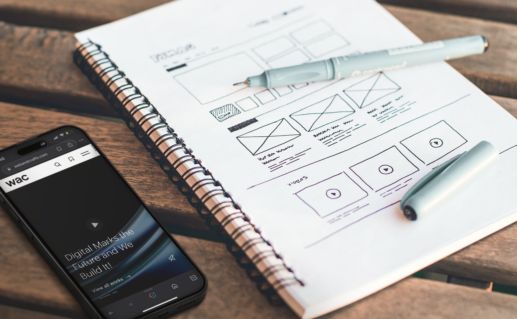
- Sitemaps, wireframing and other methods can be employed to organise content in a logical manner.
- Users can be guided through information by leveraging categorization, progressive disclosure and other design patterns.
- By making sure that users can find what they want in three clicks, proper information architecture helps eliminate frustration and boost conversions.
- It's important that you identify and fix any issues in usability so that the experience is intuitive. Before the UI is launched, the navigation and information design must be tested with users. Such iteration holds the key to building an effortless navigation experience for users.
Give Users Control
Users should feel they are in the driving seat, with controls within easy reach, familiar, and intuitive. Impactful UI design makes users comfortable and gives them a sense of control. This will also help shorten the learning curve for users; conversely, if they don’t have control, it may take them a long time to master the product, leading to frustration.
One must remember here, to maintain a balance between the two. Overly complex UI or too much control can both be taxing for the users; they must be able to use their intelligence to make decisions. Being overly innovative and disrupting user expectations in UI design will be counterproductive; the entire focus must be on providing a seamless experience.
Stick to familiar fonts, patterns, templates and page layouts; get to know your audience and empathise with them. Try to understand why they visit your site; what do they expect to see straight off the bat? What are the expectations of experienced users? Make your audience the priority, and allow their requirements to shape the UI.
Letting users undo their actions without penalties is another way to put users in control. The thought that it is possible to backtrack and return at a later time can reassure the users about the safety and accessibility of the site. Breadcrumbs help users to see where they have been and where they are headed, giving them a mental sitemap to find information quickly
Read More: SEO+UX: Secret Formula for Better Website Ranking
That’s What It’s All About!
UI design can be fun even if it’s hard work. Designers should always keep the needs, goals, and interests of users when designing the interface. Making them comfortable and giving them the feeling of being in control with clear steps, minimising the work they have to do, logically arranged information, and a proper navigational hierarchy, all combine to deliver pleasant, interesting experiences for users, encouraging them to use the app/site more, which eventually translates into increased revenues for the business.
What Does the Future Hold?
2024 is just around the corner, so here’s a quick peek into what we can expect. We can expect to see the renaissance of modern skeuomorphism, and greater adoption of spatial interfaces that open the possibilities to new interaction dimensions.
In the scenario of a constantly evolving landscape of UI design, crafting legitimate interfaces for UI continues to be a persistent challenge. The future appears exciting and challenging at the same time, and it’s likely that these trends will crisscross and continue to dictate user experiences for some time to come.
Stand out in the digital landscape and leave a lasting impression with the bespoke UI design expertise of Webandcrafts, the leading digital transformation services company. Let's create a captivating user experience. Transform your designs from ordinary to extraordinary! Contact us today to transform your vision into a visually stunning reality!
- Top 20 Advantages and Disadvantages of Social Media
- Top Advantages, Disadvantages and Limitations of Ecommerce - A Complete Guide
- Top 20 Advantages and Disadvantages of Digital Marketing
- Scope of eCommerce: The Future of Online Shopping in India
- Top 11 Advantages and Disadvantages of RDBMS You Should Know
Discover Digital Transformation
Please feel free to share your thoughts and we can discuss it over a cup of tea.


