Services Provided
Introducing a Delightfully Crafted Branded E-commerce Store for a Fresh Sales Channel Launch
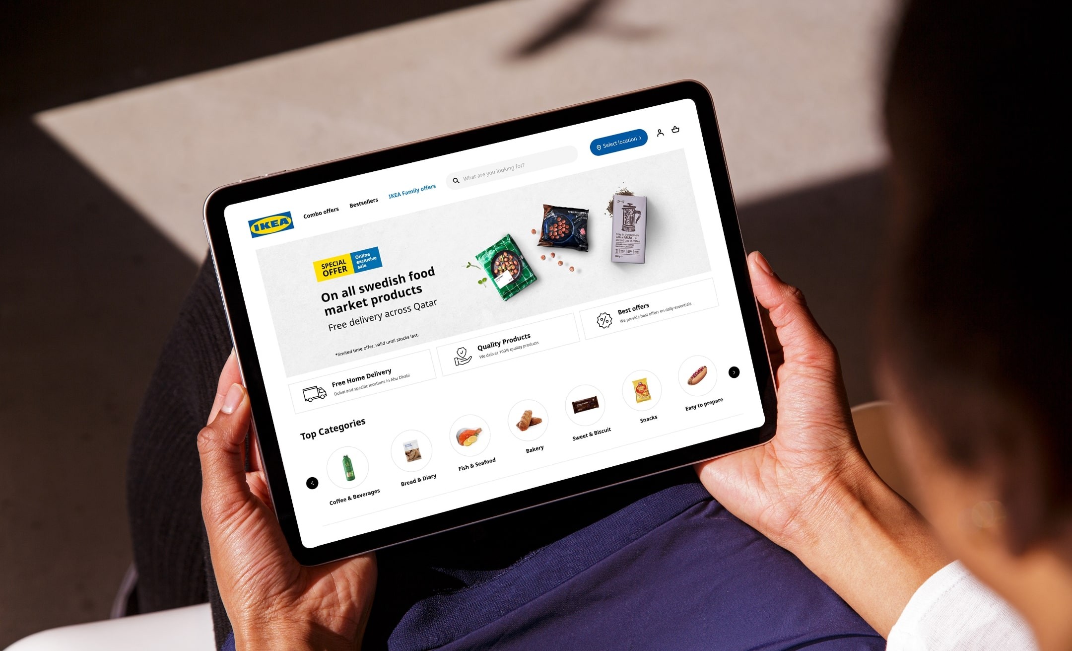
IKEA, the multinational conglomerate, collaborated with Webandcrafts to develop a high-end webpage for online food essentials. Our team crafted an exquisite landing page that is on par with global standards and, at the same time, offers a flawless UI and user experience.
Context
Making IKEA Palatable with End-To-End Delivery Solutions
On a COVID morning, with barely enough groceries to whip up a meal, every Mrs. Helpless was completely clueless looking at the hungry, wailing babies, and this scenario was increasing in numbers. This was indeed a pressing problem, and from an established furniture design tycoon like IKEA, a marvellous idea came into form!
One brand, many companies, and many, many people—that’s IKEA in a nutshell. Spread all over the world, IKEA has a passion for home furnishing and an inspiring shared vision: “to create a better everyday life for many people”. This, together with their straightforward business idea, shared values, and a culture based on the spirit of togetherness, guides them in everything they do.
Goal
Foraying into the Food E-commerce Industry
Why don’t we create a food delivery app as a norm to keep people swarming in at grocery stores when many people are still getting left out due to restrictions such as social distancing and COVID hotspot barricading?
Food eCommerce was not a newly coined term; with many giants already in place, rebranding a furniture tycoon to this niche was a game-changer. The challenge was big and heavy, yet the impact would not be less than a "big bang." It was not a complete face-off, yet adding a fresh layer of service from a completely different industry that snugged in pitch-perfectly was an elephantine task that craved technical assistance.
Challenges
Pipelining Phases That Satiated the Digital Appetite
After compiling the entire list of requirements and jotting down the technical, economical feasibility, and time framing of each requirement, the design phase was sketched out with user intuitiveness and experience at the forefront. The development phase was interwoven with agile methodologies and sprint cycles for faster development cycles with fewer pipeline delays. Aggressive test execution phases were implemented in multiple use cases, and final deliverables were exchanged within the schedule with matchless performance.
Merging the standalone app with the parent app and integrating it with the "proposed food developed app" was the first move to retain the brand presence in the "offspring app." Though rebranding was not completely possible, introducing IKEA as a food delivery service provider into the mainstream and laying the groundwork for holding a strong marketplace in food eCommerce needed a strong thought process and meticulous planning.


Process
Ideating the Tech Engine That Delivered “Food on Clicks”
The idea was in place, and all it needed was a team to brood the idea and bring it to thriving life, and IKEA found the readiness and technical brilliance in Webandcrafts. The onset of the journey to shaping a technical product that was promised to leave a big societal impact was heavy on the shoulders, yet strategic planning was all it ever needed in the first place.
Since IKEA had a huge brand presence in place, reshaping the entire brand virtues and revamping the brand identity was not possible to a large extent, and Webandcrafts started off the journey by decoding the existential brand ideals in detail and how they could be merged with the inventive idea without “standing out”.


Technology
The Tech Goodies Are on Trays and Made “Click-Bitey"
A website featuring the brand highlights with enhanced performance and aesthetic user experience elements was the prime focus. An app with end-to-end order processing, delivery management, and easy payment integration was made practically and technically feasible within a limited time frame by the versatile Magento framework.
Impact
Leaving a Delectable Impression That Moved Carts!
This multifaceted project was completed within the shortest turnaround time of six times with flawless execution, and the final deliverables were ready to use with seamless navigation and technical excellence. With a huge presence in the Middle East within 3 months of app publishing in the eCommerce market and 500–1000 daily orders, IKEA became a common name among restaurant chains and end consumers. This was due to the easy navigation and intuitive app elements, matchless ergonomics and upperhand aesthetics, and a rich user experience.




Elements
Layering the Technical Ingredients for an E-commerce Store
We stitched the technical nuances that brought out the true essence of the eCommerce store. A compact payment gateway, intriguing menu listing, engaging order placement, and seamless checkout were compiled to deliver an intuitive experience that reflected the brand persona. Every technical ingredient is summed up to deliver a palatable choice of aesthetics and ergonomics blended together for an applaudable eCommerce store.


