7 Do’s and Don’ts of Web Designing
With millions of templates available online, it is a hard task to create a versatile yet functionally promising website. For any mode of business, this serviceable website plays an important part. The people who are visiting your website need to get the desired data or information at the earliest, and you will have hardly a few seconds to convey your ideas to them.
How can we use those crucial seconds effectively to communicate with the users? Following the basic web design strategies in response to a specific market segment seems to be the conventional method.
Here are 7 easy yet practical tips on the do’s and don’ts of web designing to make a better impression on the users.
Do’s
1. Follow SEO guidelines
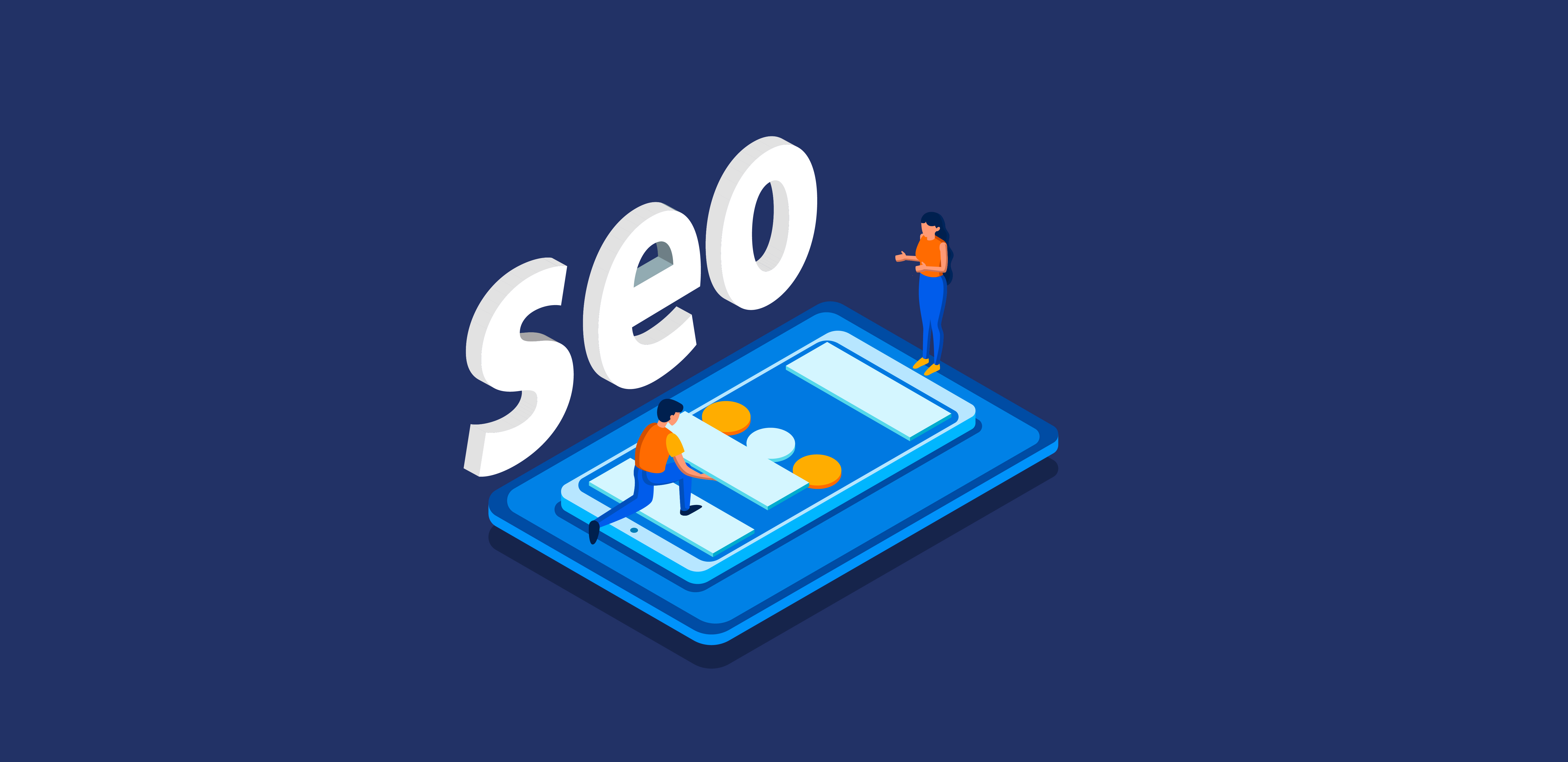
Make your website search engine friendly by following the updated SEO guidelines. If a site is performing well with the search queries, then the chances of organic traffic are very high. It directly promotes your business.
These guidelines are very simple, yet the results will be drastic. Optimizing the title, description, images, and content under the rules of search engine offers excellent value with a small period.
2. Use colour combos
Fixing the primary colour for the website means a lot in the success story of the business. It should go with the functionality of the brand and the behaviour of the intending users. Merely choosing the beautiful colours won’t make any difference in the site performance and, in fact, it may create adverse effects too.
You can go with the colour combos to make an appealing website. Try automatic colour scheme generators to make the task easier.
3. Change the colour of visited links
It is applicable when your site possesses many functionalities. Change the colour of the link when it gets clicked. This navigation technique is a super cool method to avoid your visitors to revisit the links. This practice makes a comfort feeling to the users.
4. Make your website responsive
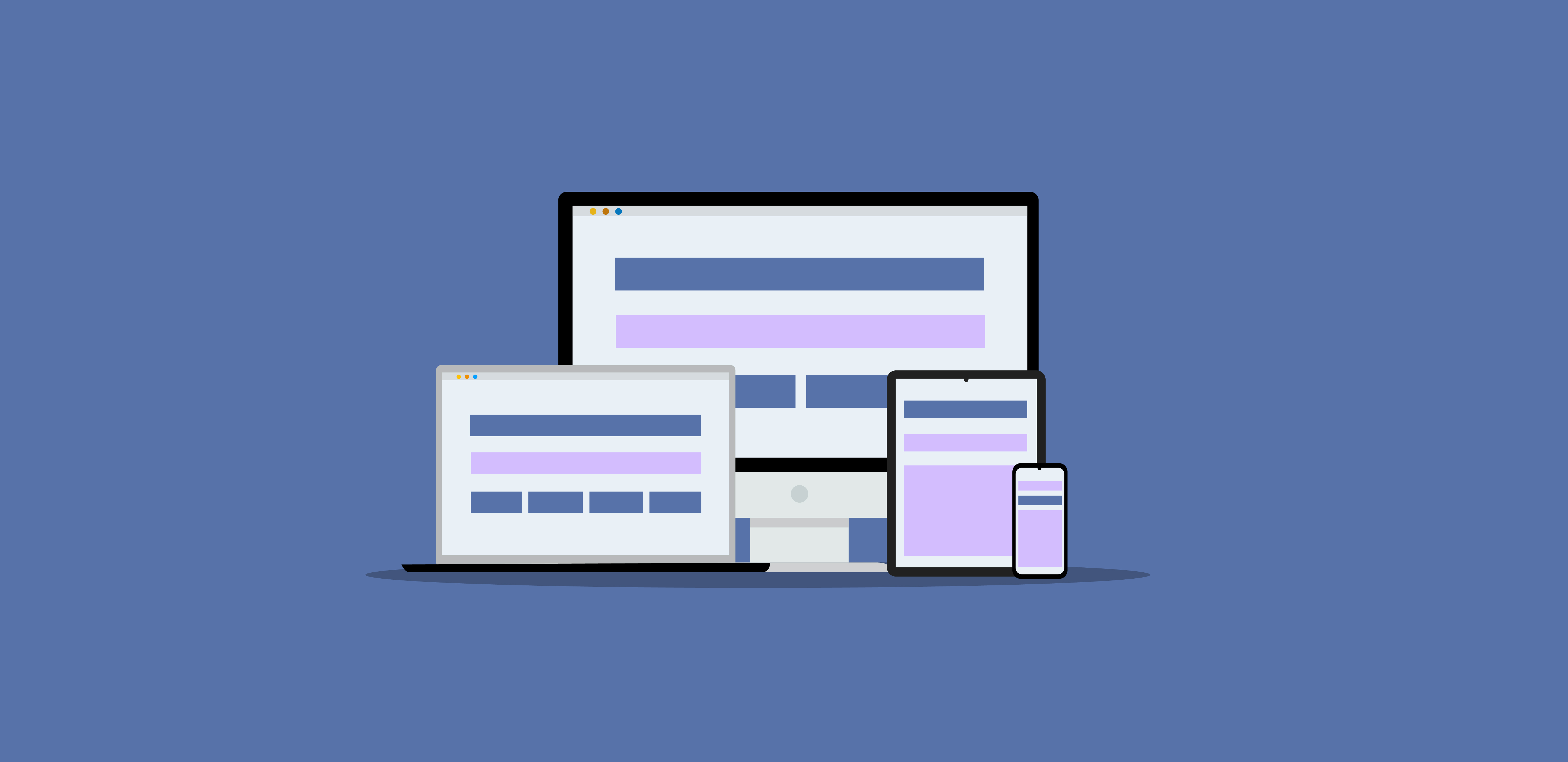
We don’t have a clear picture of how our users are accessing the websites. So, be prepared with the design that works well with all sorts of display devices. The site should possess a similar look and should allow all the functionalities to get accomplished independent of the platform.
5. Make it easier for scanning.
The visitors are likely to scan for the functionalities while visiting the website. They may not be concentrating on the content if they want to carry out some functions. So, we have to make a visual pyramid to help them. The most important services that you provide should get highlighted. Like, the Sign Up, Apply Now, Shop Now, etc.
6. Use short paragraphs and suitable content
If your site is having a large amount of content, make it in a better way to present to the users. Never post it in huge paragraphs. Try a simple design pattern to occupy small sentences and separate them with suitable white space and images. The users won’t feel amused about seeing the congested design and thickly packed content. It is all up to you to make it user-friendly.
Apart from the size of the content, its quality and relevancy also matter. Use the simple way of narration to describe your ideas and objectives. Clear communication with users always makes better website traffic and business opportunities.
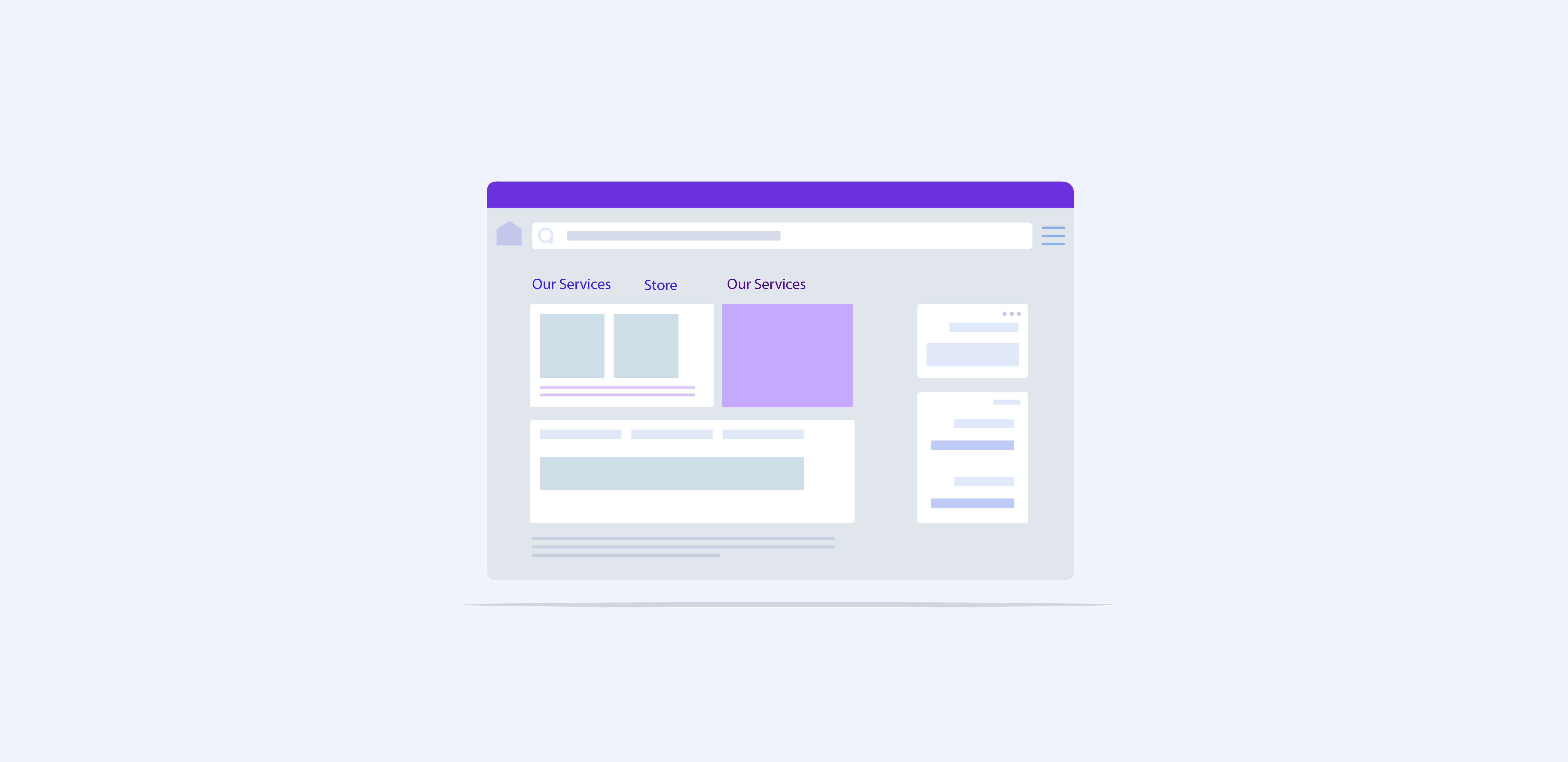
7. Clear navigation
We have already covered the effortless scanning procedure, and now its the tun for navigation. This category means a critical path in the user-friendliness. Even if your site has a profound design and colour pattern, if you miss the easier navigation flow, the user is likely to switch the site.
People want to get the desired function within the least clicks.
Even before formulating the design pattern, make a site hierarchy that includes all the menus and the sub-menus. It helps to make a clear and consistent navigation system on the website.
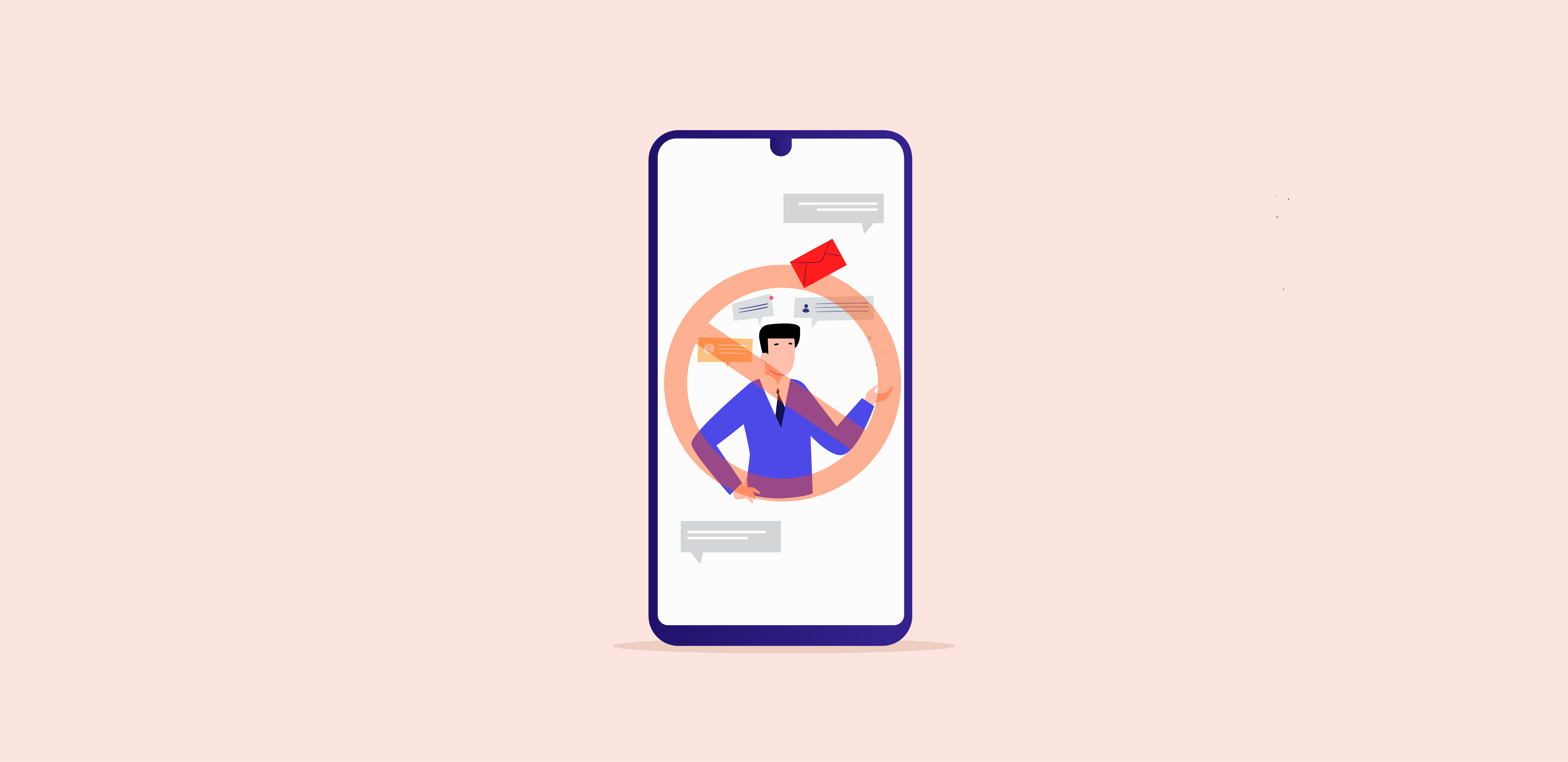
Don’ts
1. Hijack scrolling
Sometimes, the developers manipulate the scroll bar in such a way that, the user may lose control over scrolling. The movements of the website may be in a different path in converse to the desire of the user. It will create an annoying feeling in the user.
So, it is advised to stop that kind of innovations on the websites, to make a better impression on the users. Let the users have prime control over the browsing.
2. Stop the autoplay video mode
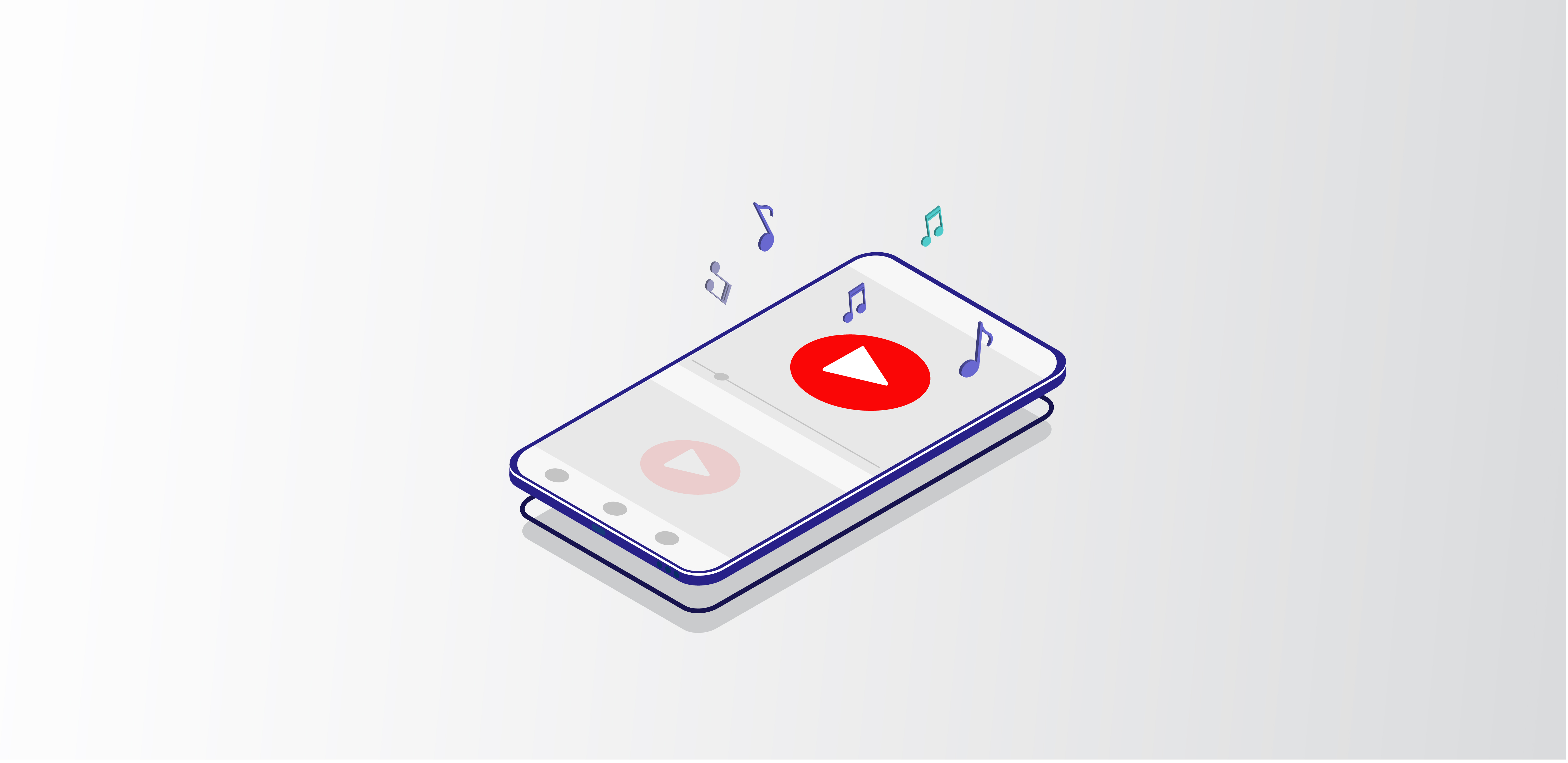
Who else would like to get interpretation while surfing a website? Auto mode video playing is such an annoying feature for the user. It disturbs the workflow and hence adversely affects the user-friendliness.
3. Flashing text and running ads
Flashing text and sizzling dynamic ads on a website makes an annoying mindset in the user. It will create difficulty for the eyes to catch out on the desired website features. This way of web designing degrades the classic look and the total appearance.
4. Too many fonts
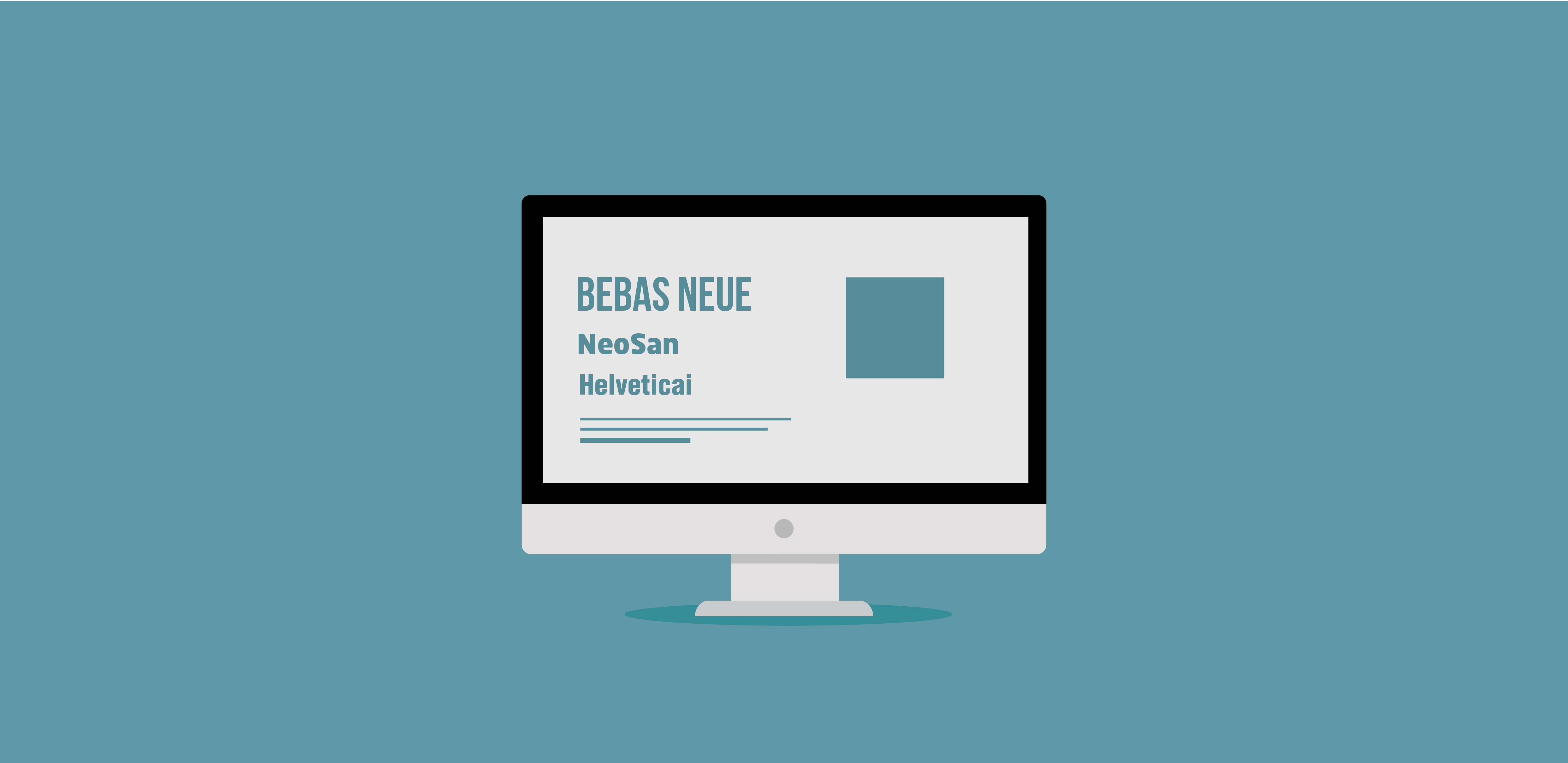
Set a primary font character for your website. Try the various size of the same category and place it in such a way that it is easily readable. Choosing multiple kinds of fonts will increase the bounce rate of the site since the reader will feel difficult to read it.
So many kinds of fonts make the website look unprofessional. A basic theory of the fonts is 3:1, i.e., three types of fonts for a single webpage — one for the main headings, second for the subheadings and the third for the internal contents.
5. Messy layout
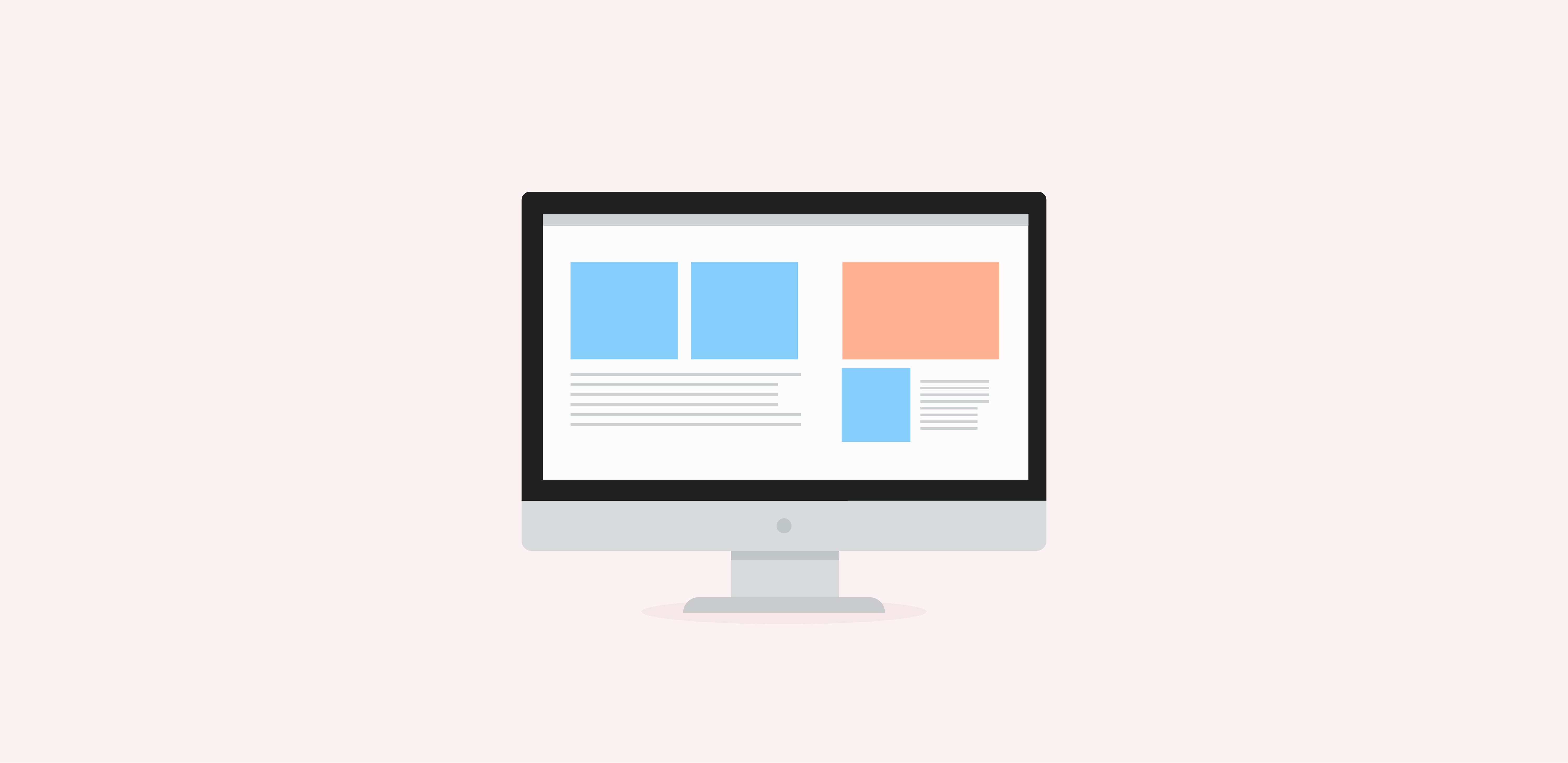
It is hard to figure out the desired features on a website if the layout is messy. No one will spend time on such a site. Build an organized design and clear structural flow to make an appealing look.
6. Forgetting the users
Users being the king in any business, if you ignore them, it turns to be a huge disaster. You may choose the beautiful themes and colour patterns, but if it cannot cope up with the taste of your users, you will fail dramatically.
Before fixing every little thing in the website design, make a study on the behaviour of the users.
Forget the fact that you are a designer and get into the shoes of an ordinary man who are seeing your website for the very first time. It will create visible changes in the user-friendliness. Follow these do’s and don’ts of web designing to get eye-catching output.
7. Over usage of colours
Colours have a substantial influence on the user’s behaviour, and while using those metrics, be careful. Each colour enhances certain kind of emotions and memories, and so focus on the users first, to fix the colour. According to the thumb rule, you are ought to use three colours on a single web page. Take your creative ideas to fix the complication of colour schemes.
Hope you enjoy reading the Do’s and Don’ts of web designing. Capturing the attention of the users to a website becomes a tough task, and it demands a particular set of innovative ideas. The design tools and infrastructure is the same for all, and the factor that creates a change in the output defines the success story. The way how new layers are adding into the layout and how the image cropping and editing programs are getting utilized makes the distinct celebrity story of Web designers in Webandcrafts. Join our team of artistic minds to start the victory saga of your business.
- How To Design An Engaging Footer For Your Website
- Custom WordPress Development Benefits: Enhancing Functionality, Flexibility, and Performance
- 9 Key UI Design Principles for an Effective User Interface
- Website Architecture Design: 15+ Proven Tips for Improved Site Structuring
- 10 Important factors you should not avoid while designing a website.
Discover Digital Transformation
Please feel free to share your thoughts and we can discuss it over a cup of tea.