How To Design An Engaging Footer For Your Website
In 2024, attracting users to your website using search engine optimisation relies on providing an exceptional user experience. Therefore, attention to every detail is crucial for ensuring a seamless user experience. The primary focus should be on delivering the best and all available information that users are actively searching for.
While there are numerous factors to contemplate when ensuring a seamless user experience on your website, this article will specifically address the website footer. As the name suggests, it is located at the bottom of a website. A well-designed footer can contribute to the overall aesthetics of a website while serving as a navigation hub, offering essential links including contact details, copyright notices, terms and conditions, social media links, site map links, CTAs (Call to Actions), and other relevant information about the website. We will explore the importance of a good engaging website footer, discuss key elements that should be included, and provide tips and examples to help you design a footer that not only looks appealing but also caters to the needs of your visitors.
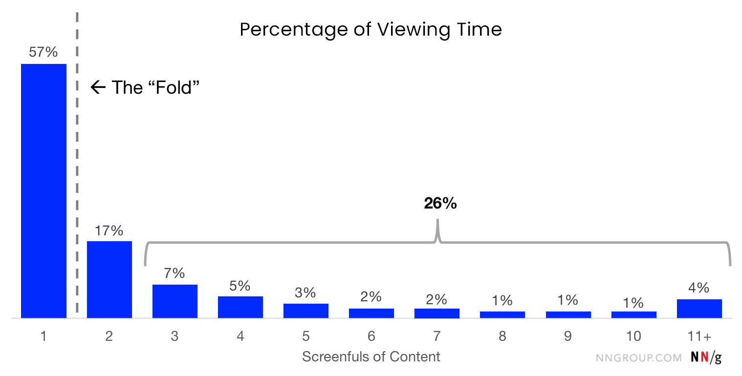
People tend to view above-the-fold content more, but according to the study done by "Nielsen Norman Group, leaders in research-based user experience, people now engage in more vertical scrolling than ever before. Observing the graph below, you will notice that the upward spike towards the end indicates increased engagement within the footer.
Whether you're a seasoned web designer or a business owner looking to optimise your online presence, understanding the significance of a thoughtfully crafted footer is essential for creating a polished and user-friendly website.
Things to consider including in the footer to increase the conversion, user engagements and, user experience:
1. Contact Information: Supply your email address, phone number, and links to social media profiles to simplify the process for visitors to contact you.
If you are running a business, users will likely come to your website seeking contact information. As a traditional way of searching for contact information online, people usually go to the footer first to find the necessary details. This makes it essential to include contact information in the footer of a website.
2. Call-to-Action (CTA): A successful footer design should incorporate strategically placed call-to-action elements. Whether it involves subscribing to a newsletter, downloading a resource, or following social media accounts, CTAs can significantly contribute to converting visitors into leads or customers. It is essential to ensure that these CTAs are visually appealing and provide clear indications of the desired actions.
Additionally, linking your social media accounts makes it easier for users to communicate with you.
3. About Us: Providing a brief description of your company or organisation can aid in establishing credibility and fostering trust.
Including a description is not always necessary if you have a well-built "About Us" page on your website. Instead, you can simply link your "About Us" page in the footer with other important page links.
4. Privacy Policy and Terms of Service: Incorporating links to these crucial legal documents showcases your dedication to transparency and user protection.
A privacy policy should be displayed prominently and conspicuously on a website. It is crucial in today's digital landscape to showcase your terms of service and privacy policy on the website, ensuring that users are aware of how digital data is handled. A privacy policy page assists users in comprehending how personal information is collected, managed and used.
At Webandcrafts, we use your personal information for providing and improving services, communication, and legal compliance.
5. Site Map: A brief site map in the footer assists users in navigating your website more effectively.
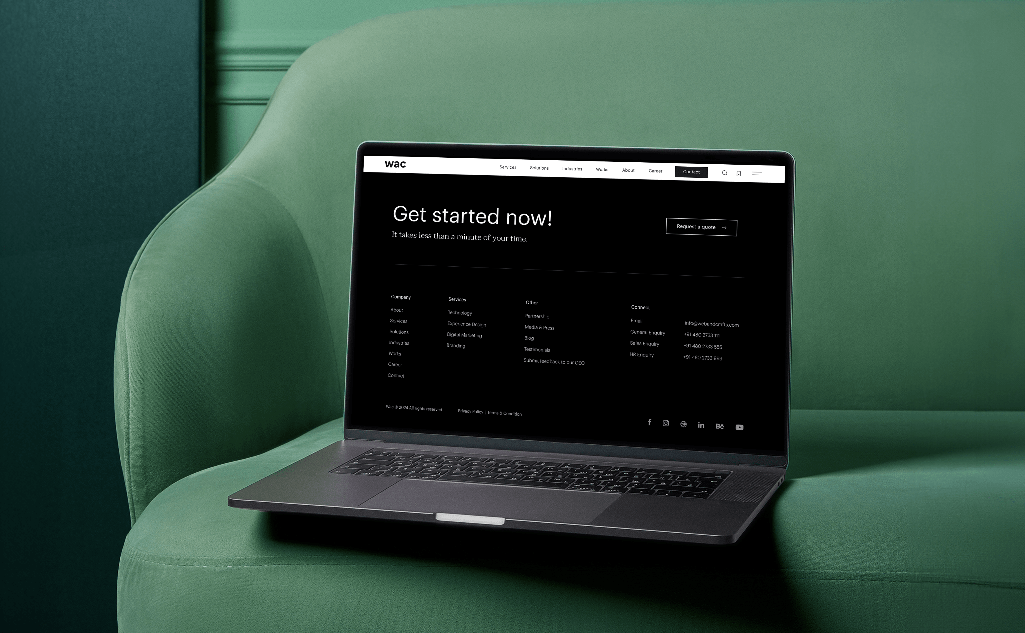
Furthermore, the footer design should align with the rest of the site’s design and font style. Webandcrafts has dedicated significant attention to its footer, ensuring that the design seamlessly blends with the overall site design. Please take a look at the Webandcrafts' website footer design below:
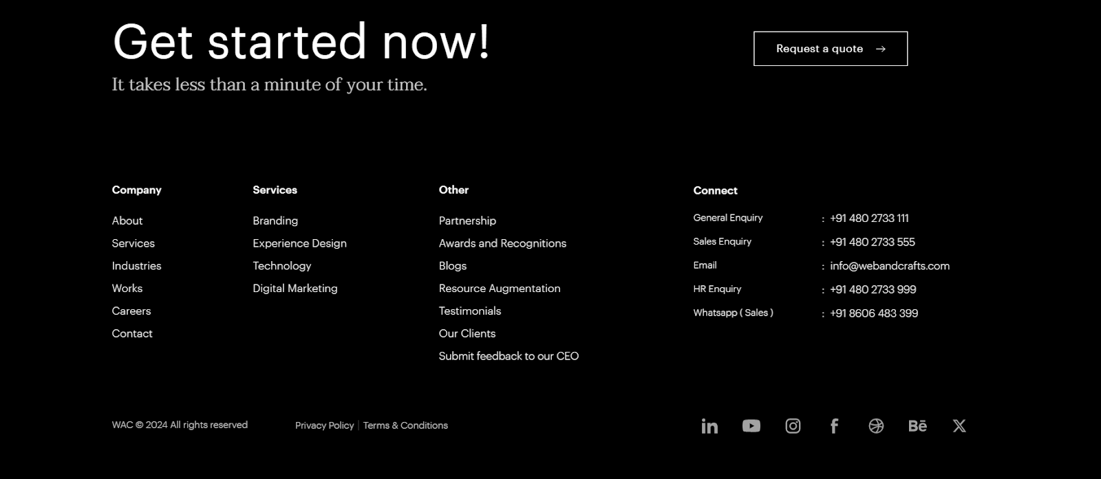
6. Mobile User Experience: Another crucial consideration is the mobile user experience. In 2024, due to the significant increase in mobile browsers, your design must comply with mobile standards. It is essential to conduct thorough testing on various devices to ensure that your footer design is functioning and visually appealing across all platforms.
Conclusion:
A well structured website footer design holds the potential to enhance user experience, offer vital information, and increase user engagement. Minimal design, incorporating key details, including navigational links, strategically placing CTAs, ensuring design consistency, and prioritising mobile responsiveness all contribute to creating an effective footer design.
Note: Every detail, even within the footer, plays an important role in delivering an outstanding online experience to your website users.
- 9 Key UI Design Principles for an Effective User Interface
- Innovate, Create, Elevate: WAC's Exclusive Workspace for Design Maestros
- The Strategic Impact of User Experience Design on Business Growth
- Website Architecture Design: 15+ Proven Tips for Improved Site Structuring
- 10 Important factors you should not avoid while designing a website.
Discover Digital Transformation
Please feel free to share your thoughts and we can discuss it over a cup of tea.


