Beginners Guide To Responsive Web Design
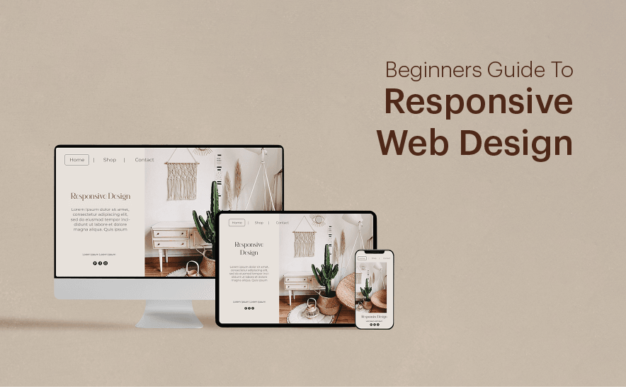
The changing need for the best technologies demands better inventions to ease the daily life with the standardized versions of electronic devices. In the prior versions of development and design methodologies, web pages for the desktop configuration were classy till the arrival of smartphones, tablets, iPad, netbook, etc. which had a different outline.
Creating separate designs with distinct features for each device seems to be out of standardization and difficult. Shortly, we can witness more experimentations on electronic gadgets. These experimentations can bring similar changes in the current development and design methodologies. Forgetting the difference in the screen resolution of various gadgets can affect the hold on other device and the users, which will adversely affect the whole structure of the business enterprise.
Over the years, a statistical survey revealed that 62 percent of increment in business is achieved by the ventures who have responsive web design, which will be adaptable with every device. In precise, this design will go with all electronic communication devices which lessens the complexity of doing excellent work for each.
Getting into the responsive design is quite confusing for the professional web designers too, since the primary aspect has slight changes. This practice is turning to a regularity which fades the primitive style of table designing CSS and more. The future of designing depends on the responsive design, and hence in-depth experimental knowledge sounds better.
This ultimate guide is focusing on beginners to professionals who can get the ideas quickly with the simple way of narration.
What is Responsive Web Design?
Once you visit the website, drag it to make lean or to the size of a mobile phone, and if you can see the whole content without disturbance that site has responsive design. Other free tools are there to check the responsiveness, but this is the simplest method to create awareness.
It was Ethan Marcotte who created a responsive design for first. He made his famous quote as ‘think and design beyond desktops, whatever be the display device, satisfy the users.’ His quote is the key ideas behind this future design technique. It is not a simple piece of technology, and rather it is a set of concepts that arranged together.
What is the need for this responsive design? In the beginning, the designs intended for the desktops. Gradually with the rise of mobile phones, the mobile version of the website was created — I.E., one as the ‘desktop’ design and another one as ‘mobile’ design. With lightning speed, tablets and other notebooks with high resolution and configuration arrived which demands a slightly different type of plan. Creating separate designs for each device sounds pretty challenging which ends up with the idea of responsive web designing.
The evolution
In CSS2.1, the style sheets find the device through ‘media types.’ In a print style sheet, you may come up with this code.<link rel="stylesheet" type="text/css" href="core.css"
media=”screen” />
<link rel=”stylesheet” type=”text/css” href=”print.css”
media=”print” />
The CSS specification list a set of acceptable media types for the web-ready devices. Many of the browsers do not go with perfection, which loses the media types.
W3C created media queries as a part of the CSS3 specification that improves the media types. This ‘media queries’ are not intended to address the device classes, but it goes in deep with the physical features of the devices.
In the below code, we are inserting a query into the linked stylesheet media attribute.<link rel="stylesheet" type="text/css"
media=”screen and (max-device-width: 320px)”
href=”shetland.css” />
In this query there are two attributes:
media type(screen)
The query enclosed with parentheses containing media feature (max-device-width) and the target value(320 px)
Here, we are performing an ‘if-else’ statement as,
If the horizontal resolution(max-device-width) is equal to or less than (320 px) .
If the ‘if condition’ is true, the device will load ‘shetland.css’ or ‘else’ the link gets ignored.
The media query specification includes media features that look beyond the screen resolution and hence in a single query we can check multiple values concatenating using the ‘and’ keyword.<link rel="stylesheet" type="text/css"
media=”screen and (max-device-width: 320px) and (resolution: 163 dpi)”
href=”shetland.css” />
Also, media queries can include in the links as @media rule.@media screen and (max-device-width: 320px) {
.column {
float: none;
}
}
From the above examples, it is clear that media queries create a set of conditional comments, to some extent it targets on specific browsers.
Creating a Media Block
At the bottom of the style sheet create a new @media block. It looks like this.@media screen and (max-width: 600px) {
.mast,
.intro,
.main,
.footer {
float: none;
width: auto;
}
}
(Here the viewport should be below the resolution: 600px)
Now, if you view this page in a desktop and if the size of the window gets reduced to 600px, then the media query will exhaust the floats. In the next stage, we can include another media query that can adjust the image layout.@media screen and (max-width: 400px) {
.figure,
li#f-mycroft {
margin-right: 3.317535545023696682%; /* 21px / 633px */
width: 48.341232227488151658%; /* 306px / 633px */
} li#f-watson,
li#f-moriarty {
margin-right: 0;
}
}
Here, we are moving to a two column layout from a three column layout, where the width is below 400px.
Mere layout changes are not the critical features in responsive designing, where the media queries can include in the CSS with the precise laws. The Fitt’s Laws on touch devices in collaboration with the optimizing practices make the picture complete.
Fluid Grids
Fluid grids can consider as a far-reaching aspect of responsive designing where the fixed hard number of pixels get changed to percentages which can be calculated using the formula:
target/context = result – Not a heading, put this in a rectangle shape to emphasize the formula
It is an advanced version of traditional liquid layout where everything calculates with percentage, but here we are emphasizing proportion. That is why the design get shrunk into a small mobile and expanded to any large device without any awkward in the plan.
Fluid Images
While considering the images, it should adjust to the size of the device and design. Using the CSS code we can achieve it.
img { max-width: 100%; }
The sentence mentioned above is a message to the browser that, the image should only be as large as their pixel value and never to be expanded. If it is inside the parent container with a higher pixel value, then the image gets shrunk.
Media Queries
Media queries are CSS technologies that play a crucial role in the responsive web design. It is usually come with a set of conditions to be satisfied. If we write a media query, it will apply to CSS only if the browser reaches a defined width. So it can be used to get the website width. In the min-width media feature, CSS style can apply to a browser design that drops below a particular limit. For mobile phones, the media query will be@media screen and (min-width: 480px) {
.content {
float: left;
}
.social_icons {
display: none
}
// and so on.
}
Larger resolutions can be made using the code as mentioned earlier. Every device will be having different size and hence choosing the best practice is required. Before fixing the resolution, you should consider the target. Usually working on a higher resolution is little time to consume and take decision wisely.
Responsive Images
Multiple pixel densities is another great deal with responsive design. To handle this high DPI displays, you can use SVG first. It is a Scalable Web Design. Anything that comes in the category other than detailed photograph or illustration can get defined as SVG. In the case of pictures and jpeg images, make it double the size of the parent container, which gets rid of the problem.
Responsive Grid Systems
We need to set up a flexible grid system in the responsive web design. For one who used the grid system, this flexible version will be easy. Here we have to change the sizing to percent from our traditional pixel. Set a max-width for your website, through which we can figure out the display on different gadgets.
Responsive Navigation
In the case of a menu, we can use a select list to avoid the clumsiness. But in the situation where a large number of menus rises, we can’t go with the select menu.
Responsive Typography
We can use either pixel for the CSS property Font size or else, can use ems. The setting should be adaptable for the screen size.
REM Units
The pixels and ems can use when the browser doesn’t support REM Units. REM is root em, which is a relative unit. Here the font size depends on the specification is given in the parent size.html {
font-size: 62.5%;
}
body {
font-size: 2.2rem;
} /* Setting 2.2rem = 22px */
h1 {
font-size: 3.2rem;
} /*Setting 3.2rem = 32px */
Here, the parent size is declared and all elements inside it will be REM declaration.
Pixel Fallback
REM units are good to work, but it is not entirely compatible with some browsers. In that case, we can go for the pixel approximation as a fallback option.
Here is the example, pixel approximation before REM unit.html{
font-size: 62.5%
}
body {
font-size: 22px;
font-size: 2.2rem;
}
h1 {
font-size: 32px;
font-size: 3.2rem;
}
Box Sizing
Box-sizing includes two setting rules. One is border-box and the other one padding-box. The border-box set the required image to a specific height and width, and the padding-box takes the details in padding.
Setting the border-box and padding-box will make the images responsive. Some other techniques are:
Cropping: CSS overflow property enables us to crop the images that fit with the display platform.
Hiding images: Media queries give the property to make display: none, which can perform this operation.
The 9 basic principles of responsive web design
Responsive web design points the concern with lack of physical parameters and fluid web which may be new to many of the designers. To get into the expert level, we should get the necessary 9 principles of responsive web design.
Responsive Web Design VS Adaptive Web design

Both these design methodologies are the complement to each other. The adaptive design uses a set of layouts for different screen sizes. For that, arrangements should design by taking the screen sizes in mind.
But Responsive web design will adapt to the size of the screen where its real size doesn’t matter. It is using the fluid style with CSS media that shapes the plan concerning the display screen.
Adaptive design is not as flexible as responsive design since layouts should be made each time according to the size of the screen. But a responsive web design is like a pot of water that gets into the shape of the vessel it gets poured.
The Flow

It is applicable in the case where screen size is small, where the contents tend to get vertical so that the last contents will get pushed which called as flow. It will help to align the materials in proper order and improves the user experience.
What we showed in the first depiction is the ‘flow’ and the second denotes the ‘static.’ Here, the contents get overlapped with the decreased size of the screen.
Relative Units
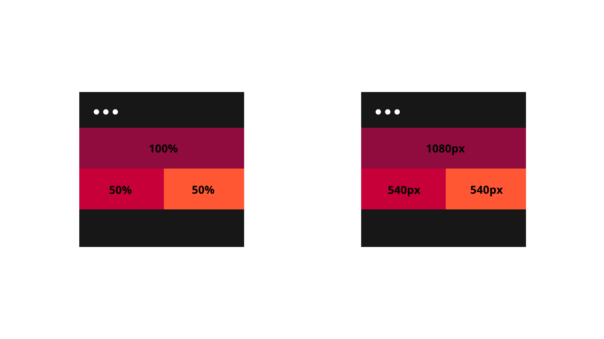
Taking units that will relate to the platform is essential. It should be flexible and compatible, and the role of the relative unit – percent rises here. If you fix the 50% broad means, it will take 50% of the screen area at any platform. But for the static units, that we described in the second illustration, it will always take the predefined size whatever be space is available.
Breakpoints
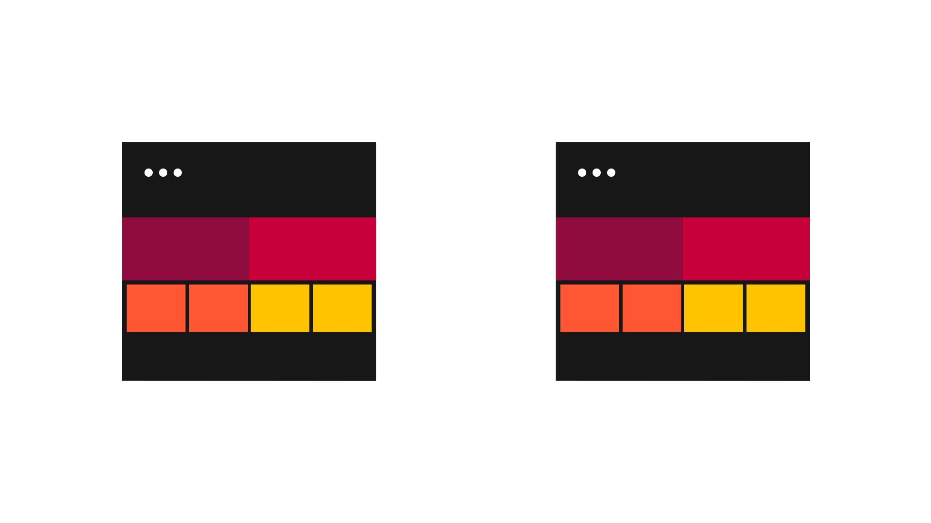
In some cases, you may encounter the problem to read the mobile version of the site. It may be because of the clumsiness of data. It can be avoided using breakpoints. It allows the layout to change at the points where it is not predefined.
In the first case, you can see four columns in the desktop, but only two columns in the mobile version. But in the later, the total design gets shrunk to accommodate in the existing space. Using a single breakpoint, we can make many changes in the CSS, but you should be well aware of its use, since it may get into the confusion what changes what.
Max and Min values

If the content of your web page is taking the whole possible stretch, it may look weird without proper boundaries or style. This issue can address by setting the Max and Min values. If we set the width as 1000px, then the content won’t exceed out. What we see in the first case is that we fixed the Max width before control the extension of the content.
Nested Objects

In a design, many elements will be related and hence controlling each part will be quite tricky. The best way to align it in a suitable method is to place them in a bottle. Pixels can contribute here. It can use with the contents that are not supposed to scale — for example, logos.
In the first case, we are using the nested version that comprises all the elements together, and in the other case, we are not nesting the elements. The outcome is evident for you.
Mobile or Desktop first

In technical terms, there is no significant change to start with either platform. Whether it is mobile first or desktop first, it depends on the prior wish of the team. But the comprehensive view on the design can be attained if you start with the mobile version.
Web fonts VS System fonts
Showcasing stylish fonts on a website is always a concern, but when we use web fonts for the same, it will take a considerable time to load the page, since each letter should charge. It increases the loading time of the page which will kick off the users. In the case of system fonts, loading will be at high speed.
Bitmap images VS vectors
Images having lots of details can use a bitmap with jpg, png or gif. For the vector, SVG will be the best choice. Many of the older browsers won’t support vector images, and also, it has more curves and takes more time to load.
Benefits of using Responsive Web Design
Responsive web design favors developers, and moreover, it gives a whole new world of web experience to the users. Here are the top 10 benefits.
Speed up the development at lower cost
Creating separate sites for desktop and mobile is little burdensome since more time should spend on each. When we go with the responsive design, we can concentrate on that single one who can create a great output. It reduces the overall cost in the initial stages as well as in the maintenance.
More traffic
Its record as 62 percent increment in the total sales happened for the companies who switched to responsive design for their websites. It is evident that people are using devices that can be handled even in a crowd and here is the importance of smartphones and other devices arises. If business enterprises fail to serve those customers, then there will be a massive difference in the total revenue.
Increased loading speed
Compared to the desktop versions, mobile websites load web pages faster. It is because of using the performance enhancing techniques like caching and responsive image display. The users are very concerned about the speed, and if the web pages don’t load for 3 seconds, they will leave the page.
Lower Maintenance
In the case of separate websites for desktop and mobile phone, we need distinct designs, contents and administrative interfaces, which is costly as compared to maintaining a single responsive web design. Additional testing and support need for the site.
Lower Bounce Rate
An optimized and responsive website offers good user experience, and hence the visitor will stay in the site for a long time by surfing new topics. It results in the lower bounce rate. Once the website loses to load the contents and pictures neatly, then the visitor will move to another site without much confusion.
Increased Conversion Rate
Once the user is well satisfied with a website with its performance and aesthetic value, he will become the customer of the service provided by the website. For the secured sites, they won’t look for another competitor to make a deal.
Improved SEO
Just like backlinks and content quality in SEO, responsive web design is also essential. Better bounce rate transfers to higher searching rank. Having separate sites will create issues with the content which can be eliminated using responsive design.
Can produce analytics reports easily
While concerning the webmaster and analytics report, it will be a tough task to point out the traffic of separate websites. In the responsive design, mapping the traffic and other stories are easy.
Improved Offline Browsing Experience
Nowadays, tablets and mobile phones are HTML5 enabled which allows users to experience responsive design even without connecting to the internet.
The improved online Browsing experience
Responsive web design is not a riddle that can answer at any point. A piece of thorough knowledge and practice can create better responsive designs with a little period. As we are going through the changing trends in website designing, try to focus on the user perspective and create future-ready websites. What we discussed above is not the last section in responsive design and user-friendly mobile approach. It can satisfy the user but can’t solve all the issues with the user experience. More chapters are to be learned to attain the full flexy.
Want your site to be responsive on all devices? Contact us at webandcrafts.com for that flawless user experience!
- How To Design An Engaging Footer For Your Website
- Custom WordPress Development Benefits: Enhancing Functionality, Flexibility, and Performance
- 9 Key UI Design Principles for an Effective User Interface
- Website Architecture Design: 15+ Proven Tips for Improved Site Structuring
- 10 Important factors you should not avoid while designing a website.
Discover Digital Transformation
Please feel free to share your thoughts and we can discuss it over a cup of tea.