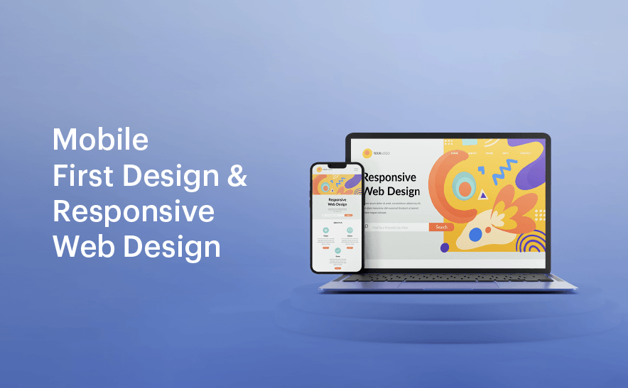
Everything you need to know about Mobile First Design & Responsive Web Design
For many of you, It may sound weird to differentiate Mobile First design with Responsive design, but the fact is, both these aspects broadcasts their own differences. For the past few years, website browsing trends are changing since more reliable devices are available in the market. The way how people get into the sites varies, and this necessitates a thorough check on the traditional design strategy.
Many enterprises are facing the dilemma on how to approach the responsive design, whether to start from the Mobile First or should follow the responsive aspect. A more deep approach on the mobile first and responsive design can wrap up a conclusion. Here we are focussing on the basic principles of these aspects along with the pros and cons.
Comprehending Mobile First Design and Responsive Web Design
Responsive Web Design
Try to shrink your browser from one side of your desktop and if you find it ok to read all the contents and the images without any distraction, that website is responsive. There are other tools to check the responsiveness of the website, but this one proved to be the most simple method. Like water that takes the shape of the vessel it is poured, in responsive design methodology, the site will be shown at the exact configuration of the displaying device irrespective of its screen size or resolution.
Responsive design starts with the desktop and then it grows down to the smaller screens like tablets and mobile. This design methodology combines the layouts, moveable grids, and images, with CSS media queries. The user can experience the website completely on the desktop as well as on the smaller screens due to the flexibility of the design. The design hides or covers some details from the mobile users in order to make the site neat. It won’t be any essential features, but the big logs.
Dealing with different designs for each device sounds panic. Here is where the use of responsive design emerges. It reduces the overall cost of the framework and maintenance to an extent while. The basic ideas in the responsive design are:
CSS Media Queries: In a responsive design, CSS media queries play a vital role. It speaks to the browser how to manage the viewpoint in accordance with the layout.
Fluid Grids and Images: In Fluid Grids, the traditional approach of pixels get replaced with the percentage, the formula is:
target/context = result
In the case of Fluid Images, we can use the CSS code:
img { max-width: 100%; }
It is the message to the browser to make the image fit to the browser.
Usually, responsive design is followed by the enterprises having B2B business where the site contains informative contents. the presence of rich HTML structure also helps in getting high ranks in search engines.
Pros
- Good for information-rich websites
- Less cost and maintenance since separate design pattern and deployment phase is not required.
- Improves traffic and results well in SEO. The search engines don’t need to crawl different websites(ie, mobile site and desktop version).
- Suitable for large formats
- One Website and one URL is another great advantage. No need to maintain different sites and the lack of redirections improves the traffic.
Cons
- Mobile experience cannot optimize to 100 percent
- Some pages on the website won’t be accessible on the mobile phone since some web components will be scaled down.
- The loading time of the website is slightly high in mobile devices because of the images. Visually they will be fit to the device, but it is only scaled down to the framework.
- Critical User Experience is a major concern. While designing, we should consider both the category of people, ie, who are using desktop and mobile phones.
Mobile First Design
The way people getting into the website has changed a lot. New statistical survey reveals that more than 63 percent of traffic is getting into the website by means of mobile phones. In the midst of such a swirling world, we should have the basic ideas of mobile first design too.
In prior to the desktop version, the mobile site will be created first. This design focuses exclusively on the mobile interface, with fewer contents and more relevant and images optimized in accordance with the keywords. Large font size and higher loading speed on these websites attract the users. The hyperlinks are arranged in such a way that the finger can touch it without interfering on other links. In the mobile first design, we have to consider the contents that should be displayed, which then grows to the design, flashy menus, multimedia, images, and other stylizing elements.
Here are a few tips for your mobile first design
List out the pages: Make a detailed sheet of pages that you should include in your mobile site.
Create a hierarchy: Try to make a tree-like structure that defines the points that you don’t want to lose.
Include large touch points: As the fingers are not as small as mouse pointers, include plenty of space for the hyperlinks so the users won’t get mislead. Apple suggests 44-pixel squares for the touchscreens.
Work with smallest breakpoints first: Start with smallest break points and then expand to the larger ones.
Imagine like an app: Forget the full-screen desktop which can showcase plenty of distinct features. Think like the screen of an app which comprises only the essential information
Get rid of Hover: As Hover is absent in the mobile, be precise to not use it.
Test Phase: Initiate the testing by keeping the user in mind and go for the redesign if necessary.
Pros
- Best user experience, since we start with the compact design patterns.
- Focusses on the majority of users who are using the smartphones
- Aims at the built-in features of the devices
Cons
- The desktop version is not completely optimized
- Not suitable for content rich websites
- Can’t embed the blog session
- Needless initial cost compared to iOS and Android app
The decision on the two methodologies depends on the project specification and customer need. Both responsive and mobile-first design has its advantages and flaws. Adapt the best one which can fulfill your project objective and provide an elegant solution for the end customers.
Discover Digital Transformation
Please feel free to share your thoughts and we can discuss it over a cup of tea.