The Art of Drafting the Best UI/UX Design

The Beginning
When Berners-Lee launched the world’s first website ‘http://info.cern.ch,’ it was just an information retrieval initiative. At that time the potential of the World Wide Web, the concept of UI/UX design, the styling language CSS, were yet to evolve. Eventually, the progression of technology and the rising need for sharing information grown so does the apparatuses and methodologies of website development. Among these methodologies, the most important one which broke the monotony of archaic user Interface was UI/UX Designing.
The increased popularity of CSS and the birth of web 2.0, enabled creative freedom to the developers and thus opened the possibility of picturesque websites. From here the factors like font, color, call to actions, forms, appearance, etc become important, and thus the concept of UI/UX design became widely popular.
How UI/UX Contributes to the Overall Competency of the Website?
In order to define that, we have to go through every phase and understand how the aesthetic factors of UI are modulated to bring the best user experience(UX) in a way it suits the particular brand’s style and nature.
Brand Analysis
The process of acquiring information about the brand is called brand analysis. Every brand is unique, and maintaining this uniqueness is important while we constitute a UI/UX design.
1. Industry Nature
Every User Interface should represent what it is meant to convey. A corporate website of a brand should represent its objectives, services, culture, etc.. through their website, and for this, understanding their business and industry nature is very important. Website design for an IT industry should not be the same as that of a Petrochemical company. The mindset of users surfing an IT company website will be entirely different from the users surfing the website of another industry company. Depending on the nature of the industry, even the color of the website must be unique. Sites can play a crucial part in lead generation and conversions; hence, your site should appeal to your category of potential users. “Representing your company well” is the message that should be conveyed to your clients through your website.
2. Services or Products Offered
A Product or service is the principal factor which needed to be promoted or elevated through the website. A clear understanding of the product and services offered by the brand is critical for framing the best interface for the user. The kind of services offered by a website plays a crucial factor in determining the type of design that can be adopted. If you are designing an e-commerce site, the emphasis must be on the products. Designing alone won’t help you; instead, you should focus on its functionality also. The website design should be such that users can easily navigate from one page to another without any confusion or difficulty. In case the website is a business site, a brief history of the company and the services it deals with should be provided. Such websites are relatively easy to design compared to that of an e-commerce website. But a business website design needs to look professional, and it should appeal to potential clients.
3. Targeted Audience
The targeted audience is the final consumer who is going to use the User Interface. The demographic characteristics of these audiences enrich us with many insights by which we can tweak our design and UX strategy for making the entire layout appealing and convenient for that particular audience.
The audience can be categorized into:
1. General – It includes the total population
2. Specific – It will be specific and filtered based on the demographics and other factors.
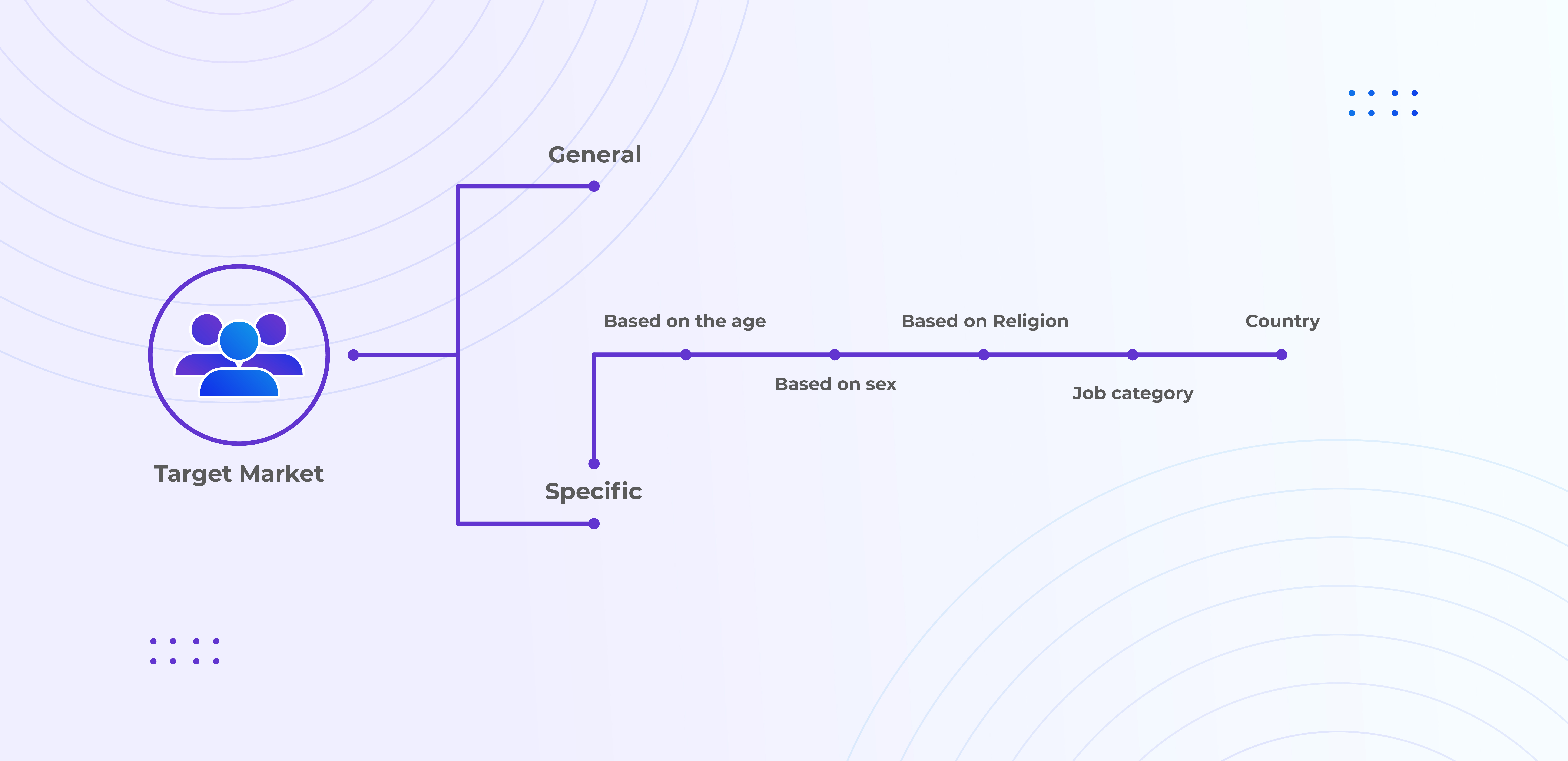
The specific audience can further be categorized based on:
- Age of the Audience
Age is an influential factor when it comes to both offline and online communication. Optimizing the platform as per the age group is inevitable for healthy and clear communication.
Age group can be categorized into,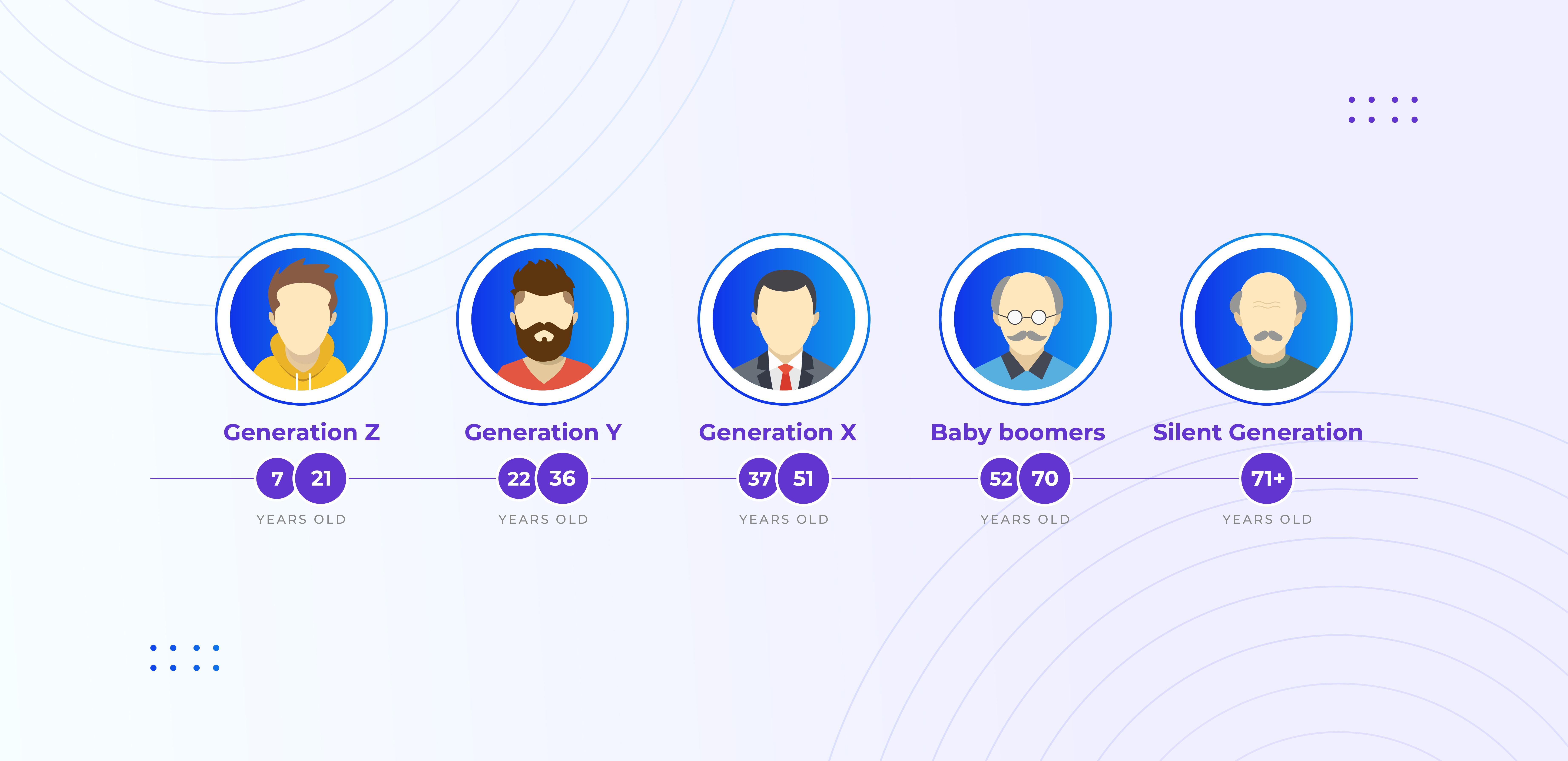
Every age groups comprehend things differently, the behavior pattern, interest, personality traits, etc will be different for different age groups, and this needs to be addressed while plotting a layout.
Generation Z – Born between 1995 to 2019, these groups of people are heavy users of mobile devices. Grown-up in a hyper-connected world where smartphones are the preferred method of communication. They have grown up in a hyper-connected world, and the smartphone is their preferred method of communication. These age groups people are more likely to be active on the internet, and 8-second rule works out for them. This generation has an eight-second attention span and judges the content more quickly than past generations. The design should be visually appealing and aligned correctly to satisfy this age group, people.
Generation Y (Millennials)- This generation of people born between 1980 to 1994 are more interested in usability and accessibility. Straightforward and accessible UI/UX design is more likely to work out for this group of people. They prefer text more than visuals or images.
Generation X – People with age between 37 – 51 falls in this category. Designs with very little or no animations are more likely to appeal to this group of people. UI maps should be straightforward and easy to understand. This age group people will appreciate long texts instead of small point texts.
Baby Boomers – Having age between 52 -70 are newbies to the world of UI and website. To make the design appeal to this generation of people is quite a hectic task. Texts used should be extremely large with font size always above 16 pixels. Asking for too many permissions while surfing the website can be annoying for this group of people. It would be wise to keep the website design simple with large texts and no visuals or animations at all.
Silent Generation – People with age more than 71, these generation people are very less active on the internet. They are extra careful will browsing the website. It would be wise to avoid any forms or other sorts of engagements in the design targeted for this age group of people. They are a silent group of people and more likely to stay away from the digital world.
- Gender Oriented Design
Men and women behave differently online. UI designs should be made depending upon the audience group you wish to target. Men usually browse to get things done while most women do it just to enjoy the process. If you want to engage people from both genders you need to consider designing by taking care of all the aspects.
- Job Category
The job category of the targeted user group is an important and unavoidable factor while designing a website. Designs that can be made for a job portal website will completely differ from that of a software service provider website. You cannot expect the same category of people to engage with both the website.
- Country
Our habitat influences us greatly, and this influence underlines the importance of user-location while constituting the anatomy of a particular app or website. The design that is accepted or appreciated in one country may fail miserably in some other countries. From the colors to icons used, people in different countries have different perspectives. For example, you cannot expect people who are used to right-to-left alignment to accept left-to-right alignment all of a sudden. Based on the country or the region you are targeting, it would be wise to tweak the designs to have better user engagement.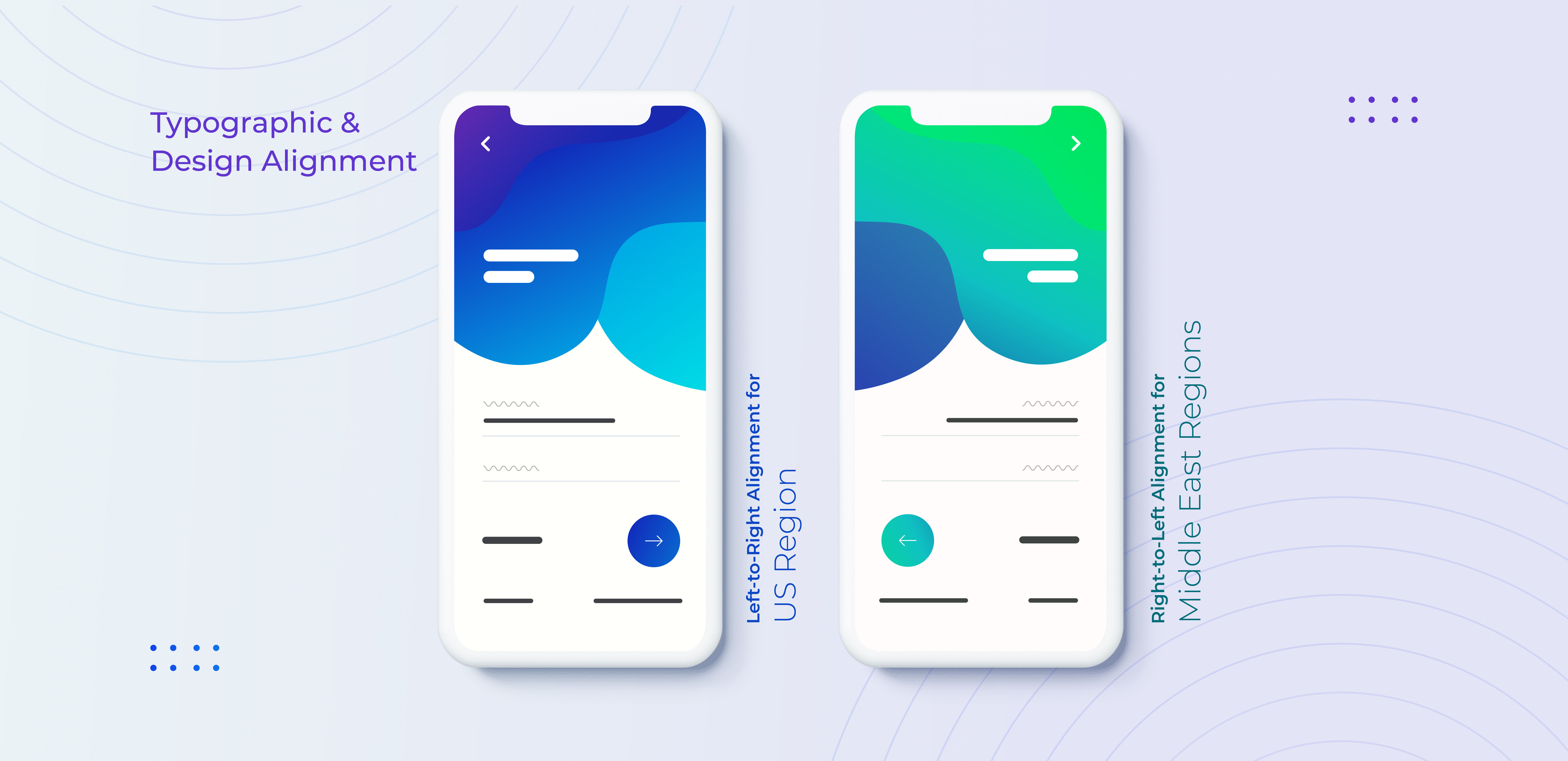
Brand’s Visual Language
By considering the data gained from brand analysis, we can further move on to the visual aspects of UI/UX:
Color is an important element in UI, it is also a very powerful communication tool. It can influence a user’s perception by depicting a distinguished theme and value. Consider an example, where we are designing a website for a company that deals with agricultural products. UI design should focus on choosing the color green because it matches with the type of product they are providing. Likewise, each color has a significant role to play in representing a brand or a website.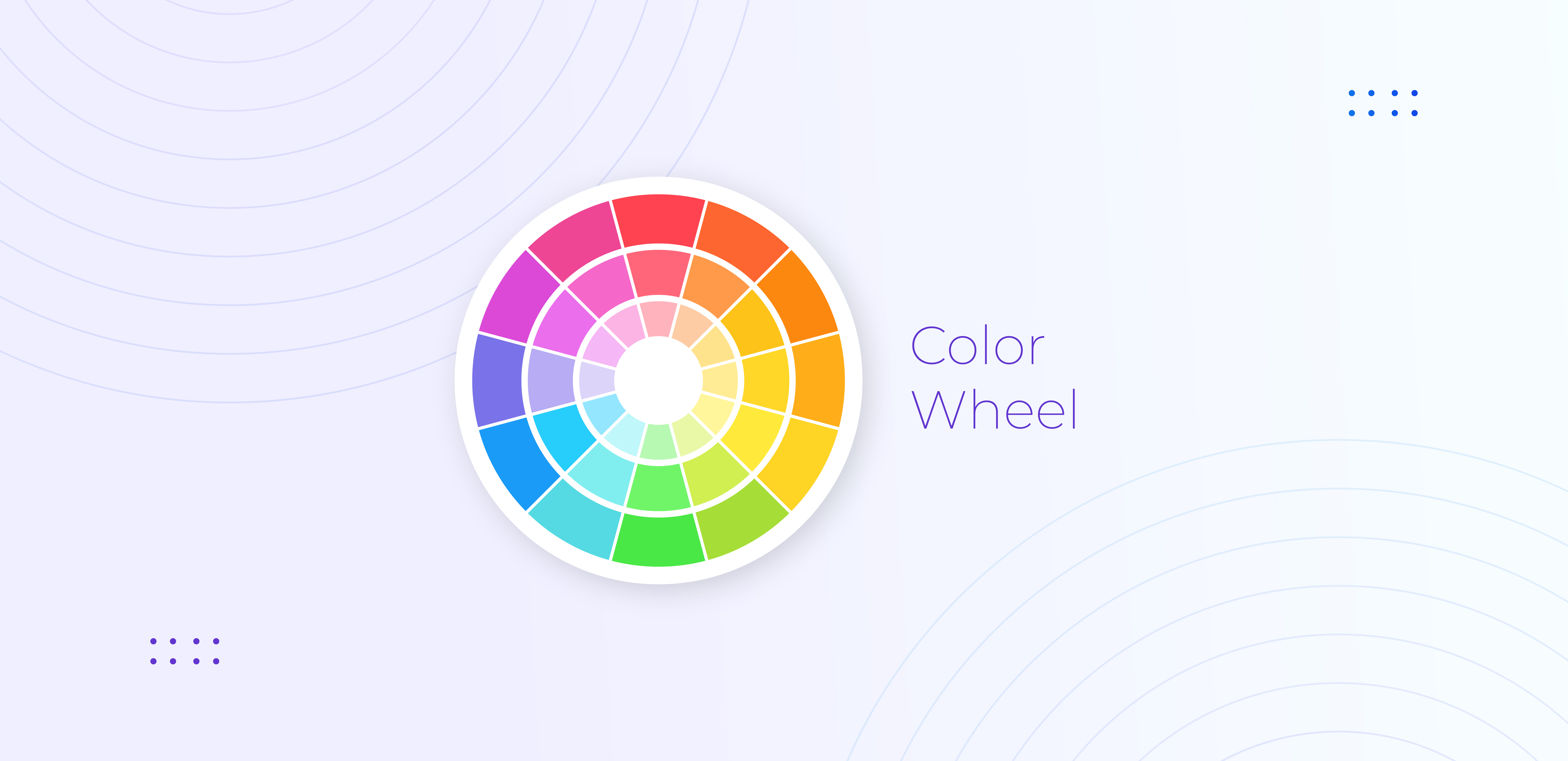
The color harmony talks about the arrangements of the colors from a user perspective. The balanced use of colors can please the audience and provide a better impression.
Some of the basic combinations of color schemes are:
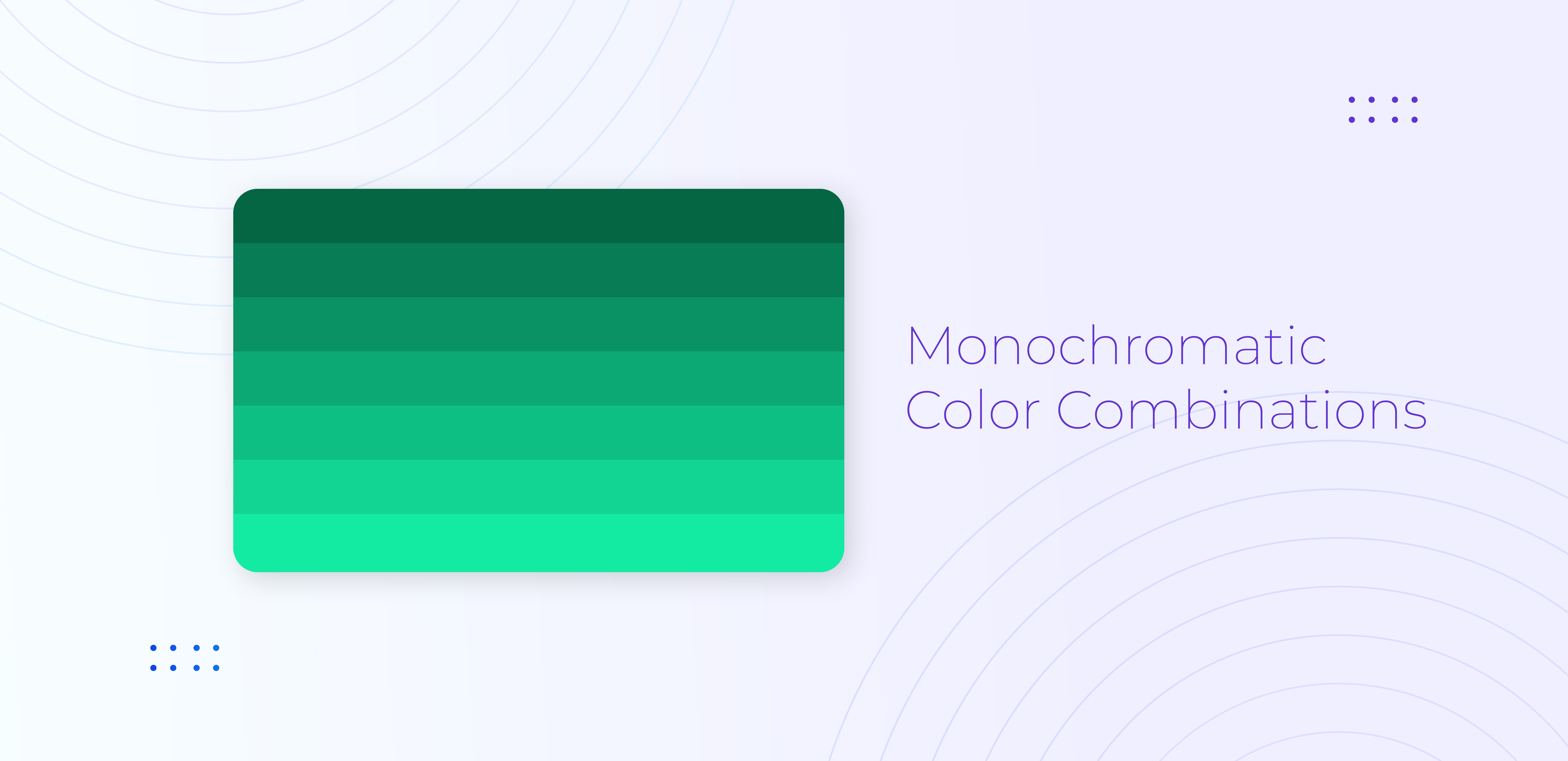
1. Monochromatic
The combination uses only the colors of a single hue and prolongs it using its shades, tone, and tints. It makes a soothing effect with tints, tones, and shades of a single hue. For a classy looking website, it will be a perfect choice. It may not pull the attention of users, but the website content can shine, and it will create a visually close-knit look.
2. Analogous
Colors that are next to each other on the color wheel. Select three colors that are close to each other on the color wheel with the middle color being more dominant. In the combination of blue-green, green and green-yellow the color green will show up in all the three designs. The analogous color scheme draws a rich feel to the designs, thereby attracting people.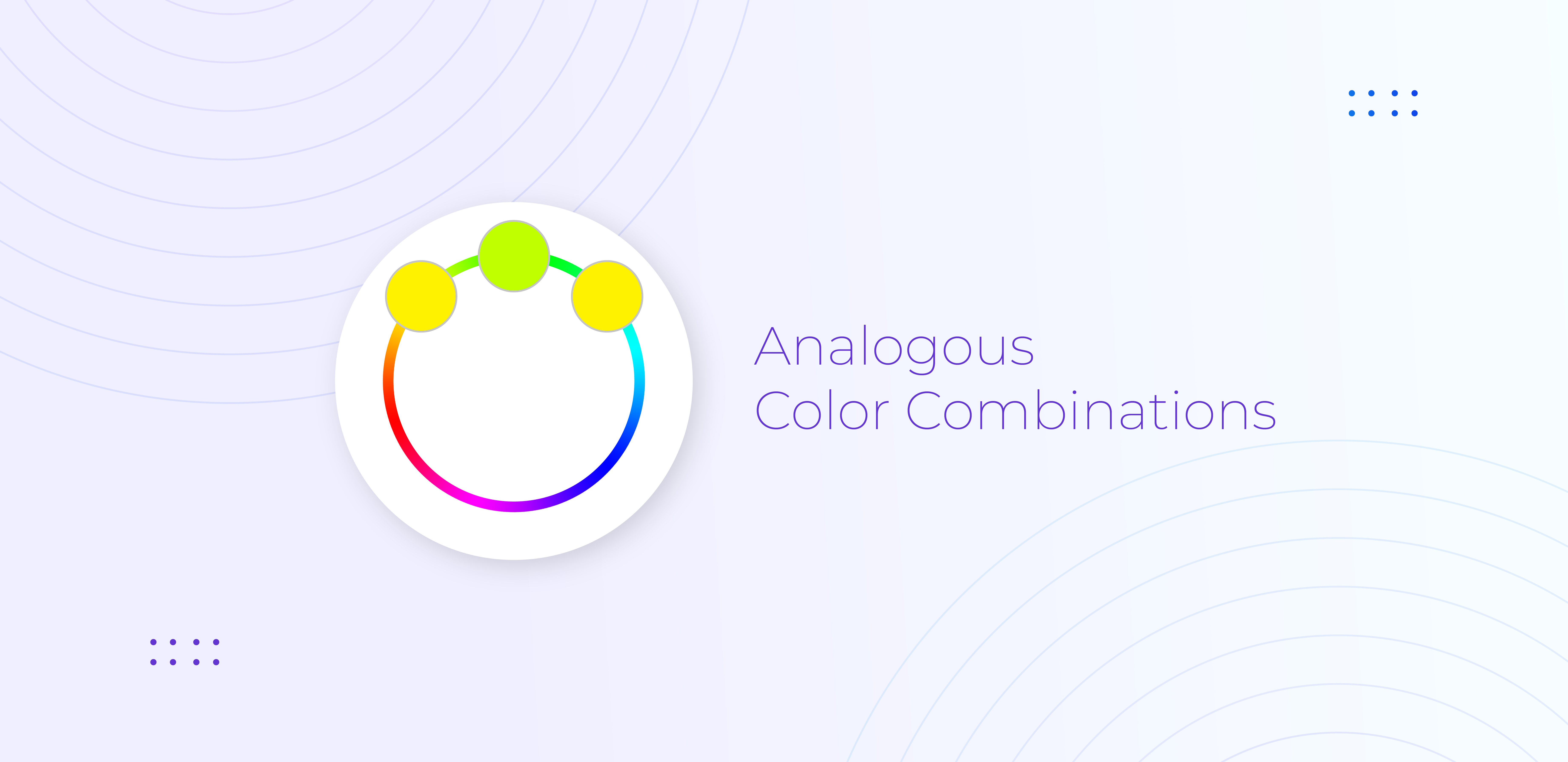
3. Complementary
It uses high contrast colors which are opposite to each other on the color wheel. Select two colors that are opposite on the color wheel. One color would give you a warm feel and the other color would give you a nice balance.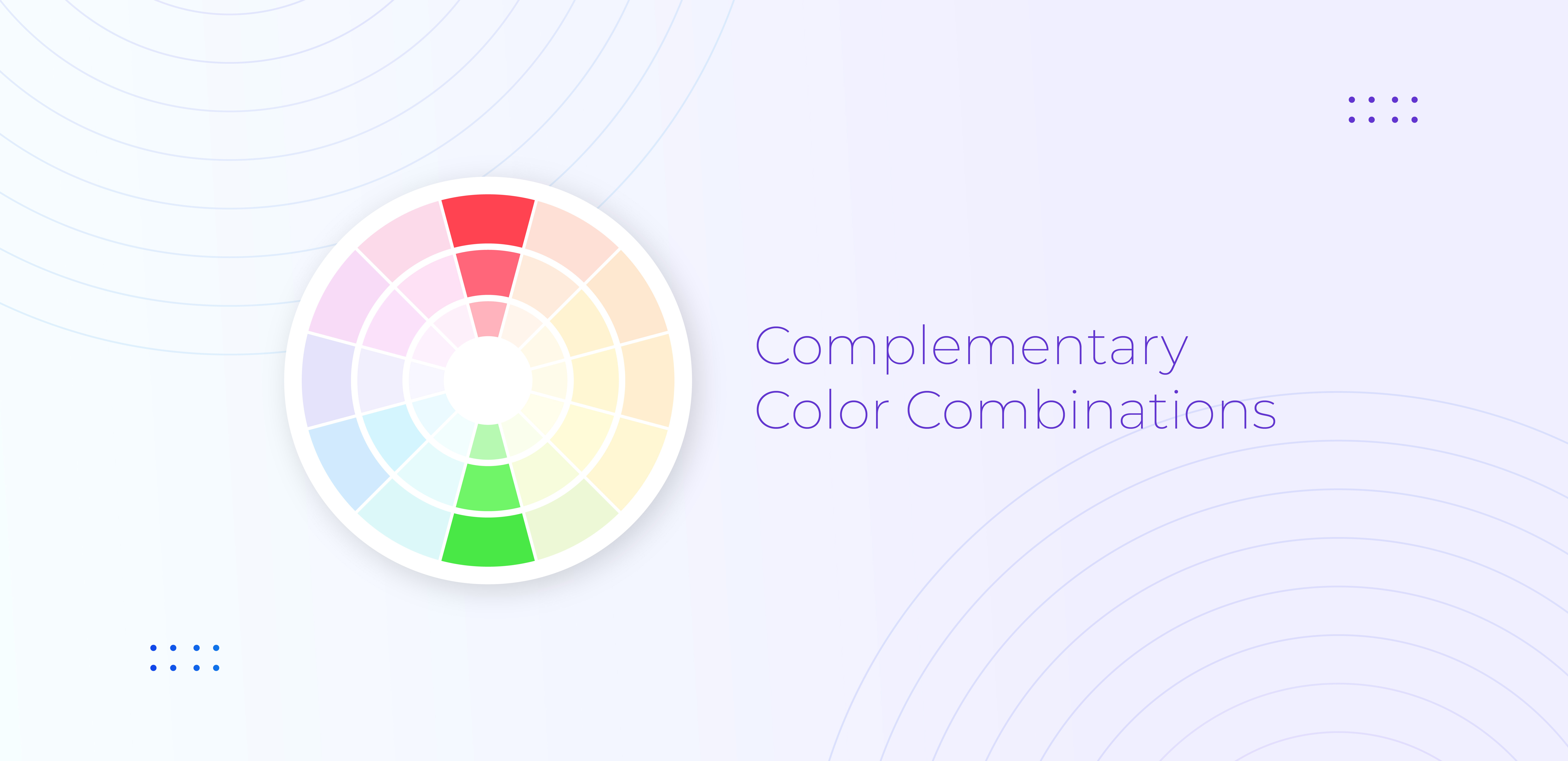
4. 60–30–10 Rule
This rule is followed mainly for coloring the interior house decorating. The rule notifies that, in order to bring harmony and composition in the design, the colors should be used in the proportion of 60%–30%–10%. The rule states that 60% of the design should be a dominant color, 30% should be the secondary color or texture and the remaining 10% should be an accent.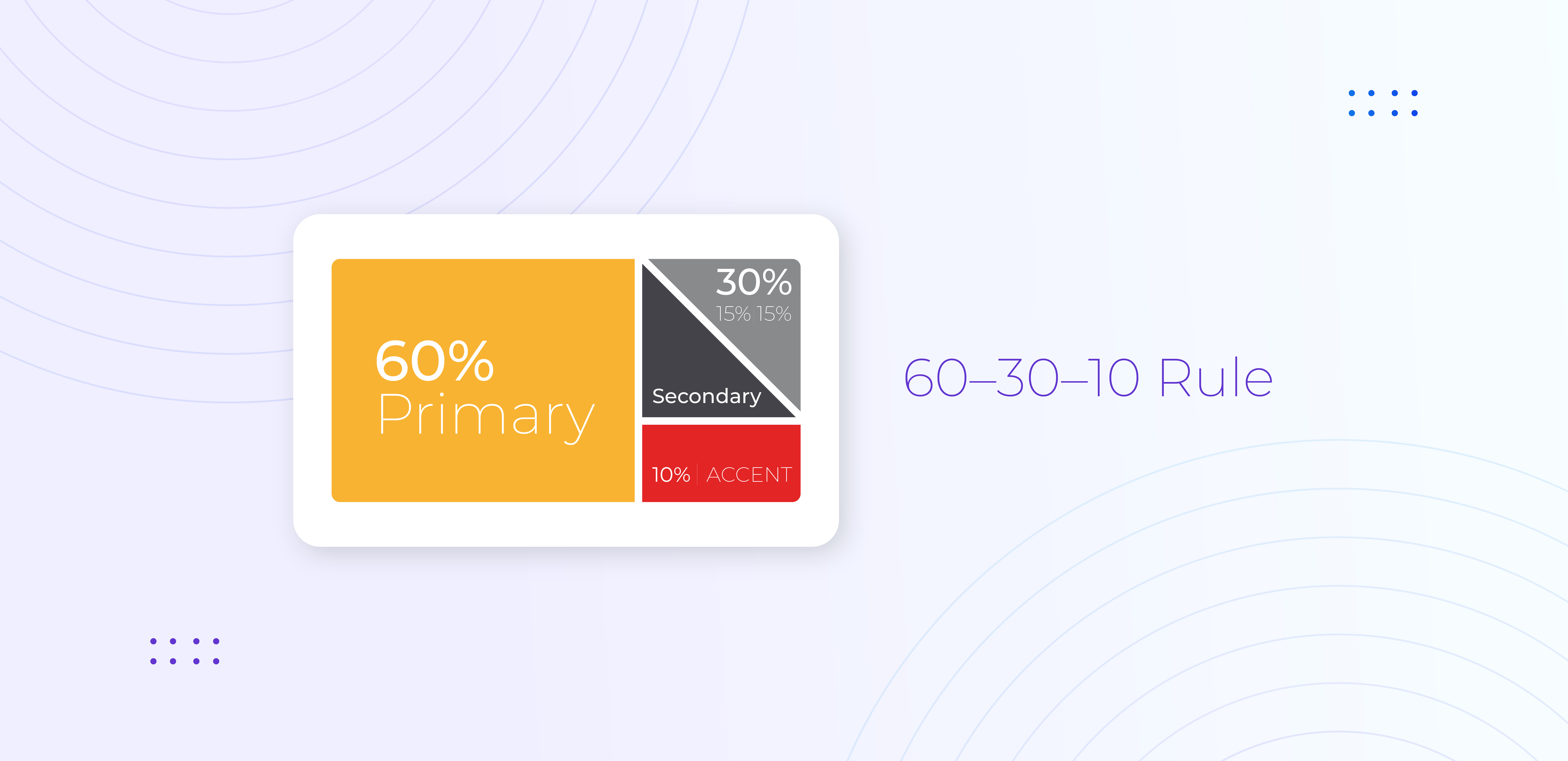
Brand’s Appeal
The most important aspect of UI/UX design is user retention or in other words, the ability to make a user continue browsing the website. There are some factors that contribute to user retention.
1. Landing Page Design
The moment a user visits your website, you only have a few seconds left with you to make the user stay online. Within these few seconds, your UI design should attract the user to continue browsing your website. Colors used, logo size, logo placement, company name, content presentation and everything else has to be neatly arranged so that the user will get impressed. The common mistake most designers tend to make is to get the design complicated by adding a lot of irrelevant content to the page. Such design tends to make the user confused which would end up discouraging the user to stay on or visit again.
2. Usability
The best designs will provide users with the freedom to navigate and use the website without any confusion. The success of a design is determined by how user-friendly the design is. User-friendly designs end up providing a good user experience.
The ultimate goal of any website design is to offer a good user experience. The look and feel of designs affect the user’s initial impression. Various factors mentioned throughout the blog is very much crucial in designing a website. There are a lot of other factors as well which determines the art of UI / UX design. The ability or skill to create unique designs that match with the requirements can help your website in improving the profitability of the product in general.
UI/UX design plays a pivotal role in shaping a website’s success by ensuring an intuitive, engaging, and seamless user experience. From understanding a brand’s identity to analyzing audience behavior, every element in the design process contributes to better usability, higher engagement, and improved conversions. A well-crafted UI/UX design is not just about aesthetics—it is a strategic approach to creating a digital presence that resonates with your audience and strengthens your brand identity.
At Webandcrafts, we specialize in crafting tailored UI/UX solutions that enhance user experience and drive business growth. Whether you’re building a new platform or revamping an existing one, our expert team ensures that every design element aligns with your brand and business goals.

Innovative UI/UX Services
Embracing UI/UX in crafting seamless experiences, keeping up with efficiency and elegance
Discover Digital Transformation
Please feel free to share your thoughts and we can discuss it over a cup of tea.